Your New Favorite Prototyping Hack: Just Use Your Competitor’s App
This is a guest post by David Bailey, Entrepreneur in Residence at Downing Ventures in London.
Before I launched my startup, 3 Kinds of Ice, I spent a couple of weeks testing my idea with potential customers, using a method called paper prototyping.
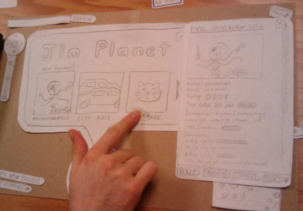
Paper prototyping is a useful DIY shortcut for testing early product concepts. Instead of building a real app first and getting it wrong, you draw out the user interface of your potential app and test the way users interact with it. It’s cheap and helps you validate your product idea fast.
It’s as simple and low-cost as usability testing gets. Or so I thought until one afternoon, when I unexpectedly stumbled on something even better: You can put in a lot less work by doing usability testing on your competitor’s app.
What competitor apps tell you that paper prototypes don’t

Admittedly, this came out of a moment of pure improvisation. I had left my stack of paper prototypes at home and had to think of something fast.
But it turns out that testing my competitor’s product as if it were my own product idea was the best idea I’d never thought of.
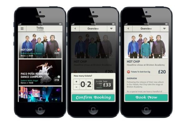
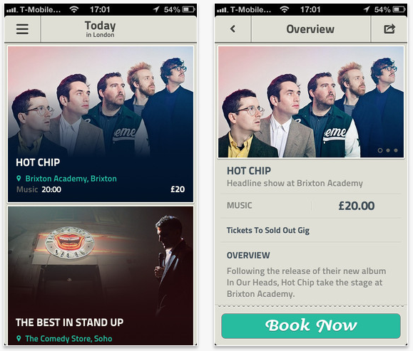
YPlan is an event booking app that helps users browse and book seats at events happening near them that night. The product I was planning was in the same space, so I had spent a lot of time combing through the app building a set of assumptions. I thought I knew what did and didn’t work with their customers.
But watching my potential customers interact with my competitor’s app in front of me shattered those assumptions.
Right away, the user tester seemed more impressed by the app’s design than I had ever been. She scrolled down the list of events, clicking in and out of them to figure out how they fit together.

Then something interesting happened: When I asked her to pick an event she would like to attend, she scrolled down the list without stopping to look at the headlines. I realized that she wasn’t looking at headlines or any copy at all.
She was focusing instead on featured images to guide her decision.
She stopped at a photo of a pizza with a glass of champagne, explaining that it grabbed her attention because “pizza and champagne don’t often go together.”
Later she scrolled right past a photo of another event featuring an image of an empty restaurant because “who wants to go to an empty restaurant?”
It was the images that were unusual or exciting that seemed to resonate with her. This little observation ended up forming the core of my product.

Paper prototypes and testing competitors go together well
Thanks to my user testers, I knew exactly what to invest in to launch my own app, 3 Kinds of Ice.
I focused on curating unusual and exciting events, knowing how much my users valued them. I also hired a content team to shoot professional videos and images and create full-screen “storybooks” that would highlight the uniqueness of each experience.
Paper prototypes are convenient, but they are missing one thing: real content. After all, showing a user tester a series of blank boxes and sketches means they have to fill in important blanks with their imagination.
That means you have blanks to fill in too. What kind of visuals and copy will potential users actually respond well to? What functionality do they value in the products they currently use? Paper prototyping helps you see how users interact with flows and concepts, but it leaves a lot of other questions unanswered.
Don’t wait to find out. You can get a head start on building a better product by mining your competitor’s product – the one that already exists.