Prioritizing with ProdPad: Using the RICE Framework
Prioritizing ideas is a key role for all product managers. As we juggle requests to try and satisfy our teams, stakeholders and customers, it can be tricky to pull off prioritization effectively.
Having a framework in place can help you to balance out these competing requests and focus on prioritizing items so that you’re building the right stuff.
What is prioritizing using RICE?
RICE is a scoring methodology widely popularized by Intercom’s product team. The framework allows any team to have a rigorous and defined way of prioritizing ideas.
RICE has a four-tiered approach to prioritization:
Reach: How many customers are affected?
Impact: What is the impact on your customers/product? Will this increase revenue? Will it widen adoption?
Confidence: When data is lacking to support your thoughts, the confidence score allows you to back it up.
Effort: How much effort will it take for your team to do this?
Good news for RICE users – the framework can easily be adapted to ProdPad!
Here’s how to do it:
Reach
ProdPad’s customer feedback tools allow you to gather qualitative feedback, ensuring you focus on building the right solutions. As this feedback comes in, it can be tagged and tracked against your product backlog. Every piece of feedback that comes in counts as a point towards the idea, meaning you can sort your backlog based on the amount of feedback linked (quantitative) and then dig down deeper by looking at the actual content sent in (qualitative).
Impact / Effort
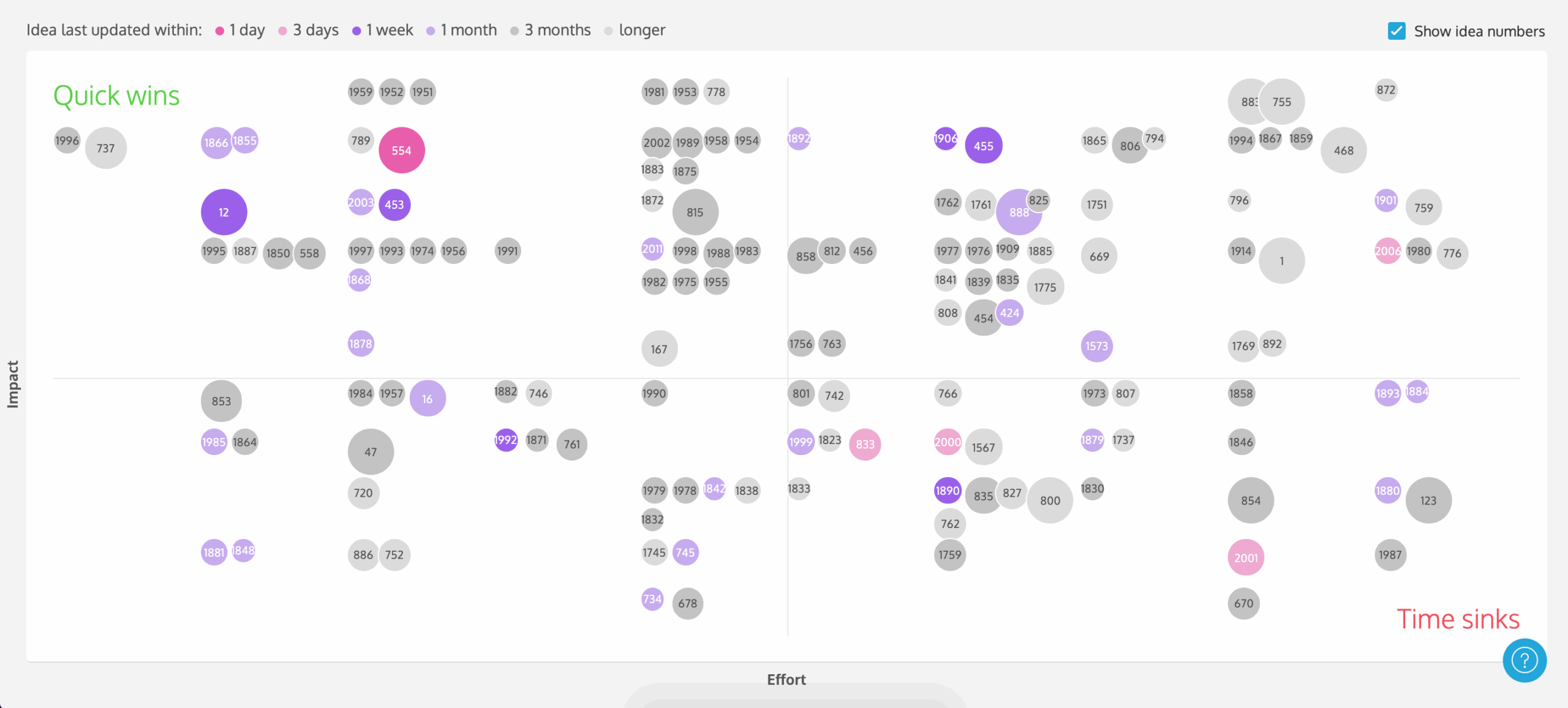
All ideas in ProdPad can be scored and visualized with our priority chart. This gives you a quick view of your quick wins and time sinkers, so you can decide where to put your team’s efforts.

There are three scales available for you to use:
- Planning Poker Scale (default)
Based on a popular Agile planning exercise, this scale follows the Fibonacci Sequence. As your estimates get bigger, the exact sizing is less precise, and therefore the numbers are further apart.
- T-shirt Sizes Scale
Another popular Agile planning exercise, with easy to understand t-shirt sizes representing relative sizes and priorities.
- 1 to 10 scale
This scale is linear for simplicity, with 10 representing the highest level of effort or impact.
When considering impact, think of the objectives in the initiative that the idea comes from. Are you looking to increase revenue? Maybe have an impact on growth?
When considering effort, consider the entire time, not just your product or development teams’ time. Will support need to rewrite documentation? Do you have to train your business-facing teams to talk about a particular new feature? Will development have to look into new technologies to implement the idea?
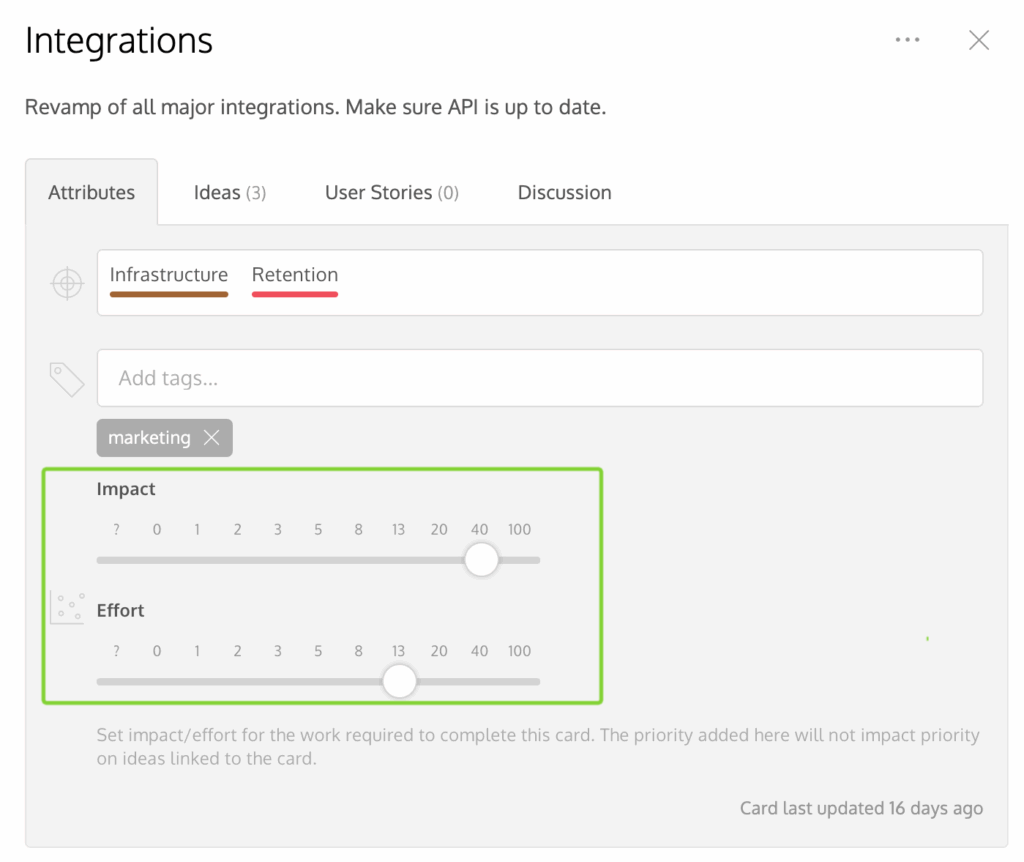
Roadmap cards also include an impact/effort scale. This means you can consider these important factors on the initiative level, not just the idea level, giving you a more well-rounded view of the project you are about to embark on.

Confidence
This is a bit of a tricky one, as it implies you don’t already have data to support your findings.
ProdPad provides you with several data points to consider, such as user segmentation, personas, feedback, tags (so you can focus on different products areas), and whether or not an idea is already on the roadmap as a few examples.
If you still don’t feel this is enough, you can always add a ‘confidence’ percentage to this. This is really just an estimate, and, like anything else, remember that it is ok for you to be wrong! You can write up your confidence score as part of the idea description, as a note, or even as a tag (which you can use to filter items out later).
Tap into the data of the priority chart to help you make those decisions. The size and color of the dot represents your confidence. Something with very little detail added means you can’t possibly be confident in it. Add a business case, work through some of the angles and risks, get your team involved to widen your point of view. All of this additional information will increase the size of the dot. Likewise, the colour of the dot represents how fresh an idea is. If it’s gone stale and grey, ask yourself: are you confident it’s still up to date and relevant? Or does it need revisiting to build confidence before being sent to development?
How to visualize it
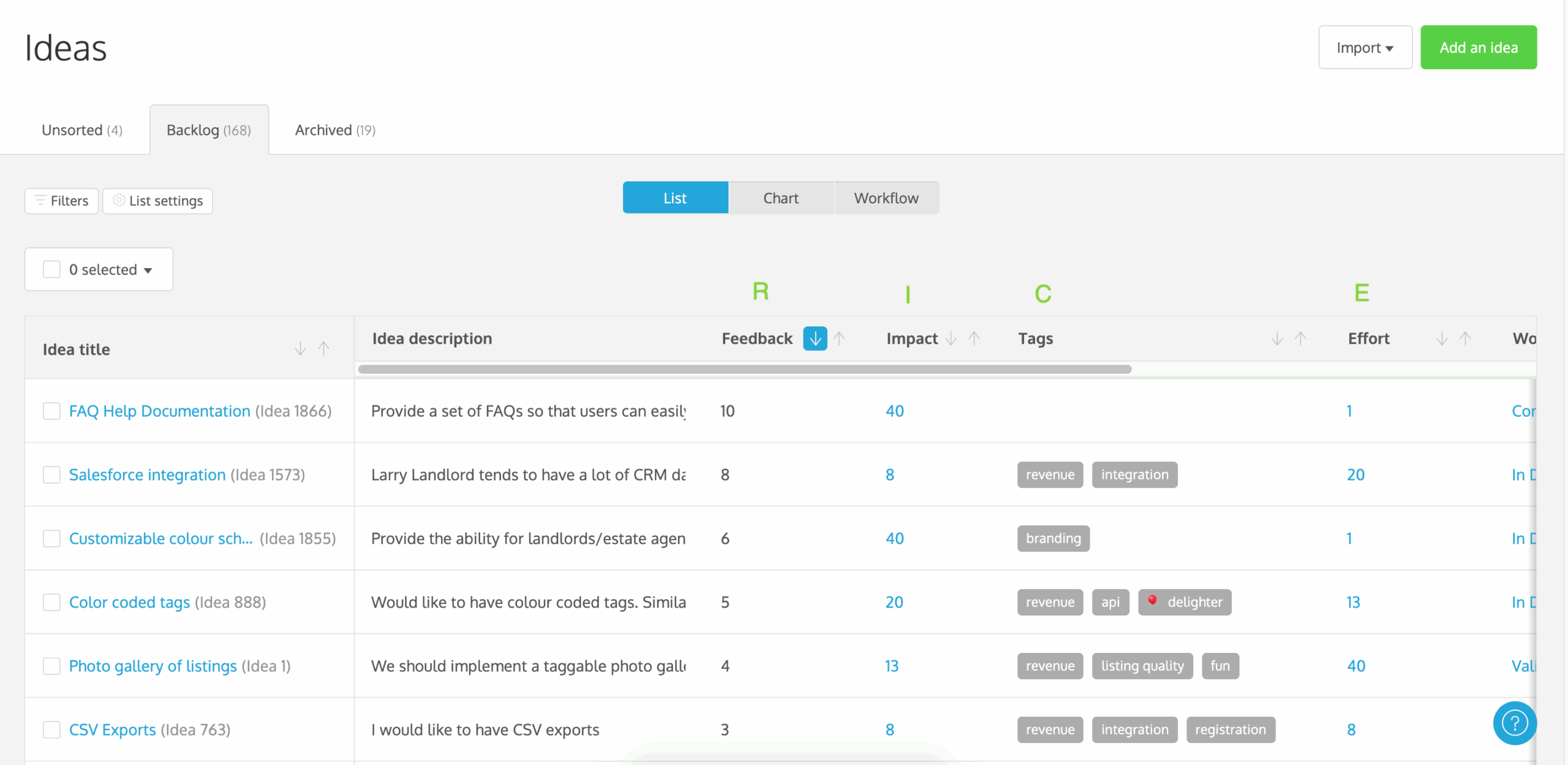
To visualize your RICE scoring, you can rearrange the ideas list to line up your columns next to each other.
Toggle on feedback, impact/effort, and your tags (for confidence visibility) and arrange them next to each other on the list settings.

Takeaways
The RICE prioritization method gives you a stable framework to work with. You can use the ProdPad priority chart to understand (visually) what to work on next. Like any other method, this isn’t a hard rule on what you have to do – rather what you could work on next. Remember at the end of the day, you know your resources better than anyone. You may choose to work on a high impact quick win, or you could choose to work on a high impact, more effort-consuming idea. What’s important is you have the flexibility and the data available to make these choices.
