How to Build a Kickass Product Tour
As a Product Manager, you know your product inside out. You understand how it works, how all its features complement each other, and how to get the most out of it. Great, you don’t need to take a product tour. But what about your new users?
Anyone trying your product for the first time will be coming in with little understanding of how it works. Sure, they may have seen a demo or played around in a sandbox version, but their comprehension of your product is going to be low. If they can’t figure out how to use your product quickly, they’re gonna get frustrated. You don’t want frustrated users, because frustrated users leave.
Product tours help reduce the friction of figuring out a new product. They act as training wheels to stabilize your customers to ensure they don’t fall off the bike and graze their knees while they’re still learning how to steer. Product tours show new users around the core functionality of your product, giving them the basic knowledge to start performing the tasks they signed up for in the first place.
These educational flows are really powerful and are an effective tool when looking to nail your overall product onboarding. Not only are they beneficial for users, but they are useful for your team, too. A product tour can highlight the key features and value of a new product, showcasing to new visitors why your product is so good. This reduces the time to value (TTV) and can help you increase your product adoption rate.
That said, to max out the effectiveness of your product tours, you need to make sure they’re actually good. That’s easier said than done, as there are a lot of pitfalls you can tumble down in the process. Here’s all you need to know to build a product tour that kicks ass.
What is a product tour?
You’re likely already well-versed in what a product tour is. You experience them every time you open a new app or piece of software, and we’re willing to bet that your product has some sort of tour or educational component already in place.
In short, a product tour is an in-app tutorial that guides users through the key features and functionality of your product. They often focus on teaching how the user interface (UI) works, what everything does, and where each feature is located.
Product tours are designed to help users get up to speed with the product quickly and ensure they don’t miss any hidden features that may benefit them. They’re activated automatically, usually triggered when a customer uses the product or clicks on a new feature for the first time.
Why do you need a product tour?
Would you trip up a baby that’s still learning to walk? Of course not. That would be horrible. Well, without a product tour, you’re kind of doing the same to your new users. Without any help or guidance on how to best utilize your product, they’re going to struggle to find the value in what you offer, and if they can’t find value they’re gonna look elsewhere.
Well, including a product tour in your onboarding process improves the chance that customers stick around. It also gives you the control to show them what you want them to see first. This lets you create a logical education flow that builds upon the previous point, ensuring that by the end of the tour, there are no gaps in your user’s knowledge.
No matter how intuitive your product is, it will come with a learning curve, some steeper than others. The goal of a product tour is to make that curve feel manageable; like it’s a slight uphill incline instead of an unscalable cliff.
Here’s a look at some other benefits of adding a product tour to your onboarding process:
It encourages users to actually try your product
You need a product tour in place for first-time users so you have a way of actually inviting them to stay! Product tours act as great initial call-to-actions to get new users to explore your product. It adds that sense of urgency which can be the difference between losing or retaining a customer. A good product tour doesn’t just show a visitor how to use your tool, it should make them desperate to use it.
It helps users reach their wow moment
The wow moment is the point in time when a new user realizes the value of your product and why they need it. It’s the lightbulb moment that flicks a switch in their head from being a skeptic to a believer in your product. You want your new customers to have this realization as early as possible – a product tour that showcases key features and benefits is going to help customers reach this moment a hell of a lot quicker.
It drives customer success
You want your customers to have a good time with your product, and you also want them to find success when using your product. That’s why you went to the trouble of building it in the first place. A good product tour gives your customers the tools they need to succeed with your product and use it properly. This improves the customer experience and boosts satisfaction, making them more likely to buy, renew, or upgrade their plan and advocate for your brand.
It can breathe life into unused features
Ever spent a lot of time on an amazing feature that no one is using? We’ve all been there. Well, if engagement for a feature is low, you could try to direct attention to it with a product tour. See, product tours aren’t just for new users, seasoned customers can also benefit from them when you highlight additions and changes. A tour is a far more engaging way to showcase a feature than an email or blog and could help you boost its performance.
How do you build a product tour?
There’s no one way to build a product tour. Each product and app is different and will require different things from its onboarding experience. That’s the beauty of building a tour – you can make it your own unique experience that best matches your product and overall brand.
That said, we do think there’s one thing that every Product manager should do:
Use tools!
We highly recommend that you use dedicated product tour and onboarding tools when building your flow. That’s what we do here at ProdPad, and you’ll find most of your competitors will too.
Nothing is stopping you from making a bespoke, one-of-a-kind product tour from scratch in-house, we just think it’s a lot of extra effort that you don’t need to go through.
For starters, building a product tour that way is hard. Unless you’re an expert coder, you’re going to need to rope in your Developers to build your tour in-app. This takes a lot of time and resources which could be spent on other things – such as progressing your product roadmap!
The process of building a tour yourself will take much longer compared to using a tool, and you also sacrifice flexibility and control over the process. As Product Managers, we like to have control.
Product tools provide no-code solutions, allowing you to build your flow, input your copy, and set up your automation easily. You can get on with it yourself without having to plan development time and you can make changes and edits on the fly. These tools allow you to move much faster and ship your product tour in less time.
As well as this, dedicated tools give you:
- Analytics to measure the performance of your tours
- Customization options
- Templates to help you beat writer’s block and get started
- Integrations with other software
What are the best product tour tools?
If we’ve sold you on using onboarding software tools, you’ll be desperate to know what the best tools out there are. Conveniently, we’ve already put together a detailed list of what we think to be the best onboarding software tools. You’re welcome.
Not only can these tools help you build product tours, but they also have extra functionality like surveys, hotspots, checklists, and more.
Read our list of the best onboarding software tools here.
What are the key components of a product tour?
When building your product tour, you have a lot of different elements to choose from that can alter how your tour looks and functions. These elements or components offer unique ways to share information and will suit different use cases. Understanding these elements gives you the knowledge to build the best product tour and choose the right option for your needs.
The elements you’ll find in user onboarding software will vary, but you can expect to find:
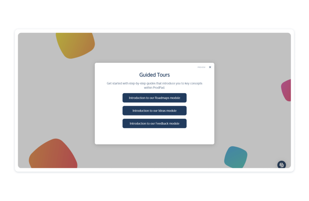
- Pop-ups: These are some of the most common UI patterns you’ll find in product tours and walkthroughs. Many products use a pop-up known as a welcome modal to first interact with the user and welcome them to the platform. They can range from simple splash screens to larger modal windows, and work by ‘popping up’ over your screen to share key information, usually in the form of screenshots, animations, and illustrations. Be mindful not to instigate pop-up fatigue by using them too often, as this can cause aggravation and lead to users dropping off.
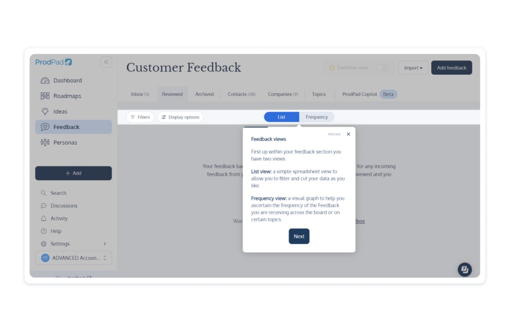
- Tooltips: This component is a small, descriptive textbox that typically activates when a button is clicked or hovered over, usually emanating from that area. Their purpose is to provide a brief, contextual explanation of what a key feature does. Unlike pop-ups, they don’t take up the whole screen. They’re designed to make the product tour more interactive and engaging, and often instruct the user to do something.
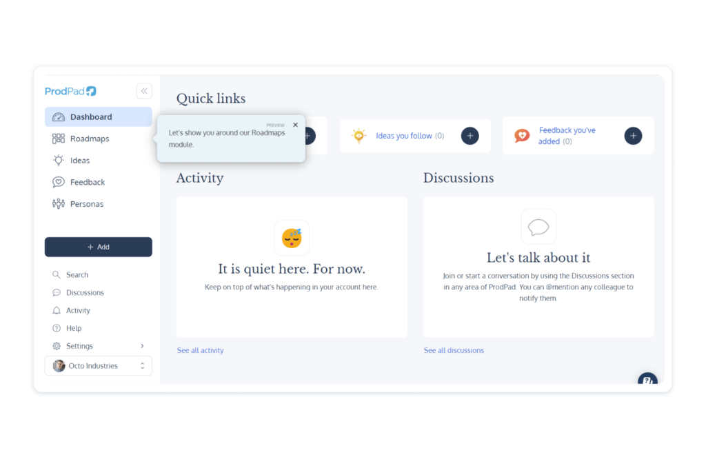
- Hotspots: Hotspots are short and sweet little messages that encourage users to check out a certain area of your product. They’re effectively call-to-actions, and can say things like ‘click here’ or ‘psst, you may want to see this’. They’re designed to encourage and are often followed by a tooltip.
- Slideouts: Slideouts are interesting-looking panels that slide out from either the side, top, or bottom of the screen. These are thought to be less intrusive than pop-ups as they don’t take over the whole screen and still enable the user to engage with the tool. They’re often used to encourage customers to take specific actions.
To make sure you use the right components, you need to consider what element best suits your product. There are some questions you need to ask yourself to make sure you’re building your tour the right way.
Think about:
- The device type: is your product a mobile app or web-based? The difference in display size will impact what types of elements best suit the product. Small tooltips may be harder to see on mobile, requiring a full modal window instead.
- Your different users: Do you have a varied target user base with differing understandings of technology? If so, you may have to build two separate product tours to suit each experience level. A novice may appreciate more tooltips explaining simple functionality, while an expert may get frustrated with these interruptions.
- The uniqueness of your product: Does your product follow industry conventions or does it do something completely different? If your product works the same as others or has familiar features, then users will have a better time getting to grips with it and won’t need as much information from the tour. If it’s all brand new, then you need to thoroughly explain these new changes.
- The complexity of your product: Are the core features of your product easy to find or do users have to navigate through multiple layers to access everything? Opting for contextual product tours that trigger when a user finds a new feature can work best here as it ensures they’re not overloaded with too much information at once.
Product tour best practices
To ensure your product tour is the best it can be, it’s worth knowing all the best practice theory. All great product tours tend to have the following qualities, so make sure you consider them when building your tour.
Make it easy to use
The whole goal of your tour is to make your product simple and easy to understand. If your tour is too complex, then you’re kind of missing the point. The elements you add to your tour should be self-explanatory in terms of how to use them and how to progress to the next tooltip, slide out, or pop-up.
Structure it well
You want to build a product tour that naturally flows from one point to another. Your structure plays a massive part in this. It needs to intuitively guide users from one section of your product to another, in an order that makes sense.
When building your structure, make sure your users understand what they’re learning, what they’re trying to accomplish, and what they stand to gain.
Keep it light
We get that you’re excited about your product and can talk about it for hours, but you need to hold back in your product tour. You don’t want to overwhelm your users with too much information. Remember, reams of text can be boring to read.
Less is more when it comes to your product tour. Keep your copy tight, short, and snappy, and don’t dwell on features for too long. Figure out what is crucial for users to understand during their initial exploration and limit your tours to that. Users can always build on their knowledge in their own time with self-help guides and chatbots.
Make sure it’s not boring
A boring product tour is just as bad as having no tour at all. If your language is dull and your content just doesn’t inspire, your tour isn’t going to be effective. You want users to have a good experience with your tour, so use engaging language and images to keep them invested in what you’re teaching them.
A bored user is more likely to leave your product and look elsewhere for a solution to their problem.
Get to the point
When making a product tour, you want it to be quick and snappy. You need to respect your customer’s time and ensure you don’t keep them from using your product for too long.
Quickly show them what they need to know so that you’re not wasting any of your user’s time. When they first log into your product, they’re going to want to start getting results instantly. Don’t let your tour become a barrier that they’ll want to skip through.
Make it interactive
A passive tour is more likely to bore your users. It’s a good idea to make one that offers an interactive element. A tour that’s just made up of pop-ups or a single video explainer that users can easily skip through won’t work as well as one where they need to perform an action to trigger the next step.
By building a product tour with automation, you can make it more interactive to engage the user with your product. With these types of tours, you can get users to start exploring your tool while you aid them, helping them to better learn how it all works while keeping them engaged.
Lead with value
Your product tour should be more than just a step-by-step guide on how to use your tool, where all you’re saying boils down to ‘do this, then do this, then do this’. You need to show why you’re getting your customers to perform an action and make clear what the value of each action is. By being upfront about the benefits of your tool and how it meets their needs, you’re showing them the value proposition early on in their journey.
Personalize for better engagement
Each one of your users wants to feel unique. Make them feel special by adding personalization to your product tour. This can be as simple as using personalization tags like their name so that they feel more connected with your product.
You can also go further and create different tours based on different audience segments, showing them the key features they specifically care about. Not all customers are planning to use your product in the same way as each other, so try to identify this and create a product tour that displays the right messages and information that’s suited to each user.
Keep making data-driven improvements with feedback
You’re not going to nail your product tour the first time. To make the best one possible, you’re going to have to make changes and edits to your flow. To help guide you, be sure to monitor user behavior to find points in the flow where users drop off, or where there are elements of confusion. Most onboarding software tools have analytics built in to help you make changes to optimize the user experience.
Don’t use internal language
When building your product tour, be mindful of the language you use. Your customers do not have the same vocabulary as your internal team, so make sure to stay away from jargon or complicated industry phrases.
You also want to make sure that you provide definitions for terms. The main goal is to make your product tour easy to understand, so don’t complicate things with internal language used by experts.
Examples of good product tours
One of the best ways to know what goes into a good product tour is to see them in action. We’ve found a handful of what we believe to be great examples to act as inspiration for when you go off to build your own.
Check out these examples to learn what you should be doing when building your product tour.
Of course, we think we’ve put together a pretty nifty product tour ourselves, but we don’t want to pat ourselves on the back too much, so we’ve gone for other examples. However, if, as a Product Manager, you want to experience a tour designed specifically for you, then start a free trial of ProdPad and give it a whirl. Of course, there’s no commitment and no credit card needed.
1. Grammarly
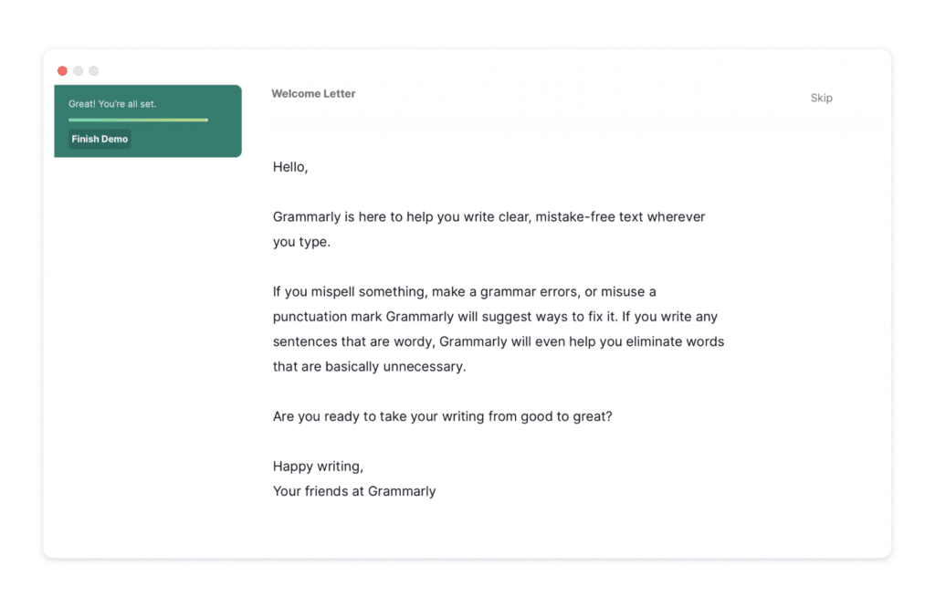
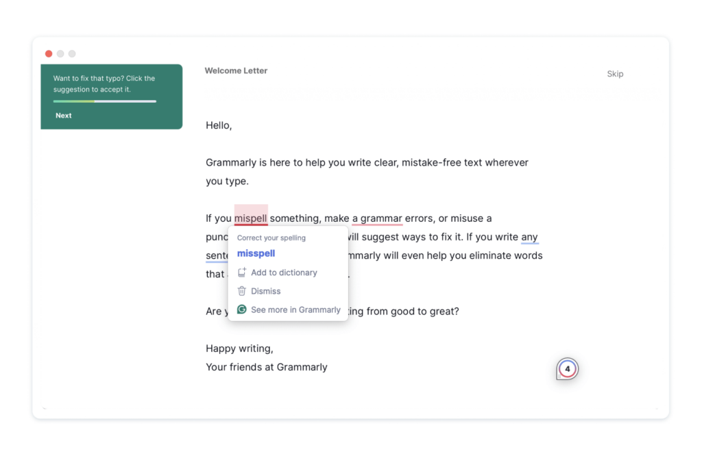
Grammarly has a well-renowned product tour that we think is ace. When you start the spell checker for the first time, you’re put into a demo environment that lets you play around, similar to the ProdPad sandbox. This environment is then supported by hotspots and tooltips that divert your attention to key aspects and features.
What’s really great about the Grammarly product tour is that they don’t force you to take part but rather ask if you’d like the demonstration. This is great, as there may be a lot of returning customers or users familiar with similar tools that may not need the extra help.
Plus, thanks to the tooltips and hotspots, Grammary’s onboarding process becomes more interactive, helping the user to actually learn while keeping them engaged.
2. Slack
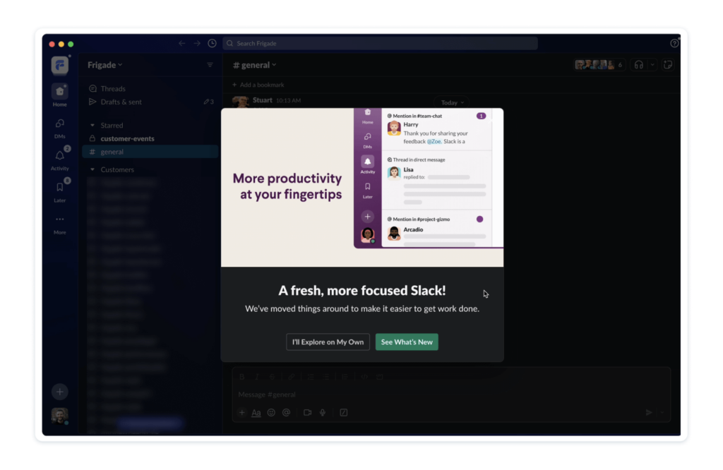
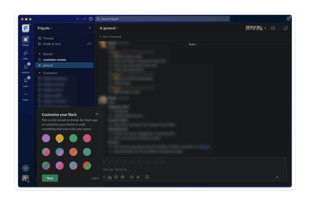
When Slack went through a major layout and UI redesign, the platform offered a product tour to help users through these key changes. This product tour excels because it utilizes personalization well to connect with the user. Here, Slack made use of native components like a theme chooser so that each experience felt tailored to each customer.
All the elements also looked pretty snazzy and well-designed, and the placement of tooltips, animations, and more helped to instill confidence in the new layout. A great touch is that once the tour finished, users were directed to the Slack Help Center, where they could access more information if they wanted to.
3. Hubspot
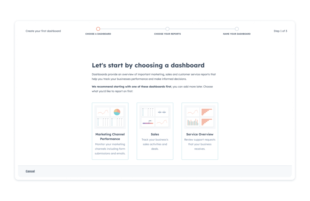
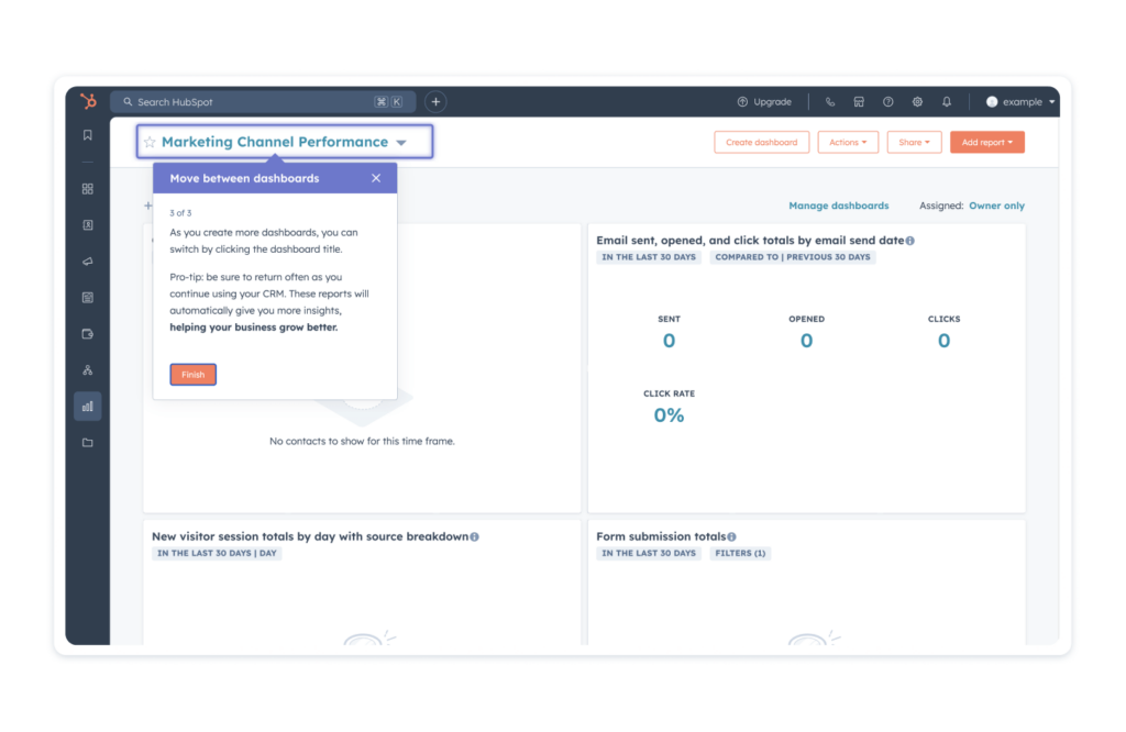
Hubspot offers a great example of a product tour that knows its audience and its product. It opts for a simple tooltip approach, using minimal text and flashy elements to keep things easy to understand. This benefits Hubspot because it’s a massive platform, so having a comprehensive and long product tour could overwhelm and confuse new users.
Opting for simple tooltips makes the whole tool feel easy to use. Highlighting certain sections of the product is also a great call, especially as they pulsate, giving life and urgency to the instructions. It’s a small touch that keeps the tour dynamic without bombarding the user with too many visuals.
Lead the way with product tours
By adding a product tour, you’re making it much easier for your users to engage with and understand your product. They’re like little guides showing off the key sights and information of your product, ensuring that users know the basics to effectively explore your product themselves.
A great product tour can go a long way in improving customer satisfaction and reducing customer churn, helping to ensure that new customers stick around with your product and become active users. By using the right tools and elements, and by following the best practices, you can make a product tour that does the business.
Again, if you want to see how we’ve approached our onboarding and product tour, and want to see the key features of ProdPad in action, start a free trial now. We’d love to know what you think.
See our product tour in action.