Customizing your CFP Widget (Blog 2 of 2, finally!)
In the first tutorial I talked about going beyond the basic styling for ProdPad’s Customer Feedback Widget to customizing your widget visually and making it your own.
In this tutorial, I’m going to explain how to:
- Set up a custom trigger for your widget
- Creating a help menu that triggers the popup feedback form (which we used to have in our app)
For this tutorial, all you’ll need is…
- Your widget embed code
- Access to your own codebase
- A text editor (I use Visual Studio Editor)
- A basic understanding of HTML JS and CSS
- Another good cup of coffee!
Setting up a custom trigger
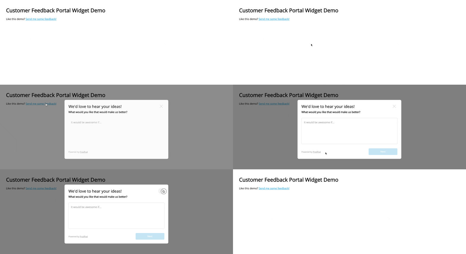
Ok, so you have your widget, but you want to trigger the popup feedback form from another element on your page; this might be a different button or a text link like this:

First of all, we want to create a listener in JS for any element clicks. I’m going to use a specific class (so that it’s reusable in multiple places across the page) and mimic the functionality of clicking on our existing widget button. But, you could use an ID if you only wanted to trigger it from a single point on your page.
I’m going to use a class with the name trigger Widget. You can use whatever name you like, just make sure you update the relevant references in the script and HTML.
Note: I’m using a class rather than an ID in case you want to trigger the widget from multiple places.
With pure JavaScript:
Or if you’re using JQuery:
Now let’s add our class to the HTML wherever we want to trigger the popup feedback form on click:
<p>Like this demo? <a href="#" class="triggerWidget">Send me some feedback!</a></p>
Hurrah! The feedback form should now be triggering where you want it to.
If you want to hide our initial generated feedback button – simply go ahead and hide it via CSS so that it is no longer visually showing on the page:
#pp-cfpiaw-trigger {
  display:none;
}
Note: we’re not removing it from the DOM as we need it for the previous script to trigger clicks.
Creating a help menu that triggers the popup feedback form
Now that we know how to create a custom trigger, we can do some pretty awesome stuff like create a help menu with a link that triggers our popup feedback form.
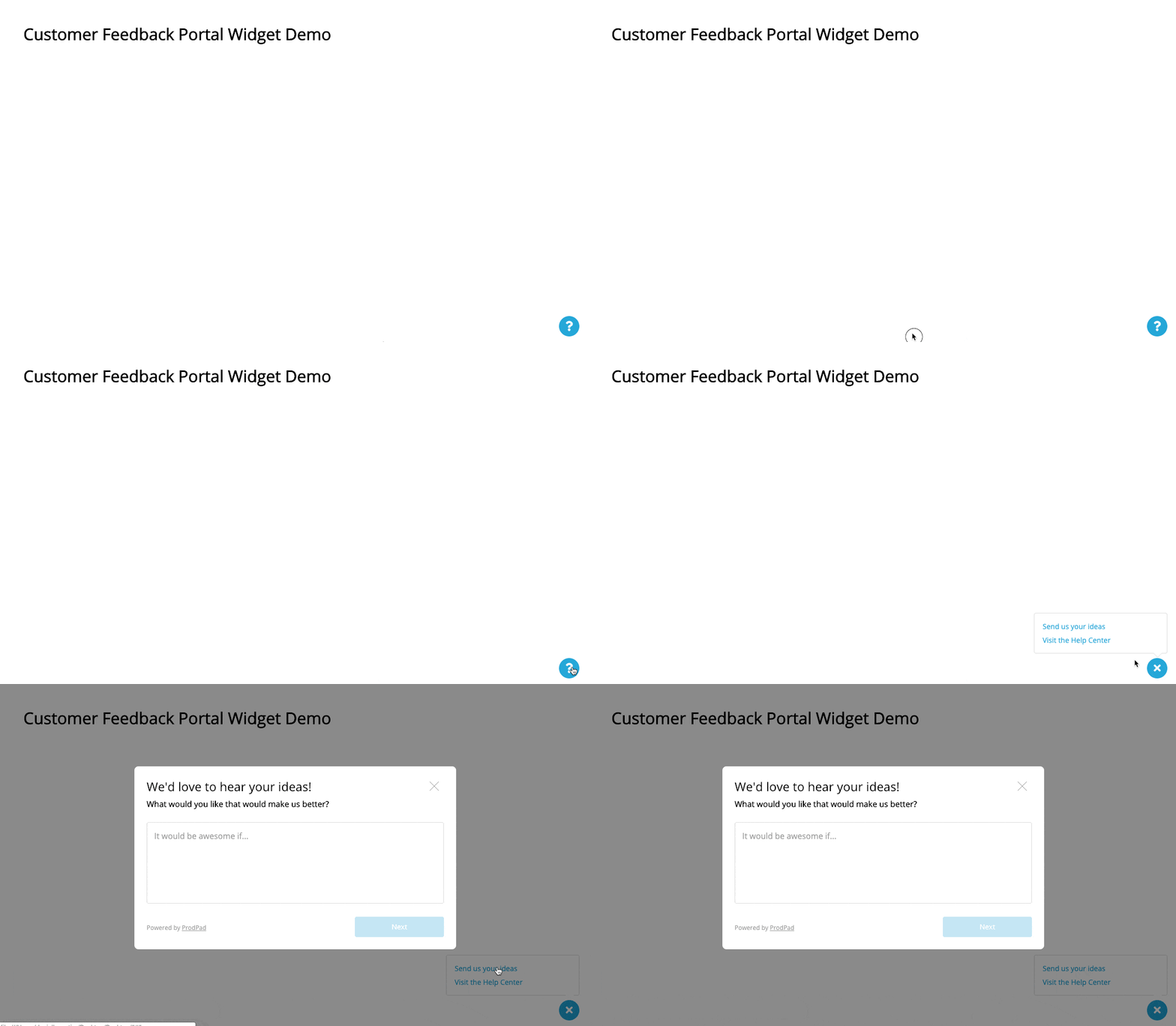
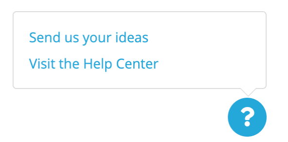
You can style this however you want, but I’m going to show you roughly what we used in ProdPad (before we launched our Intercom help tool):

First of all we need to create the button that acts as our help menu trigger.
We have a custom font for our icons in ProdPad, but for this demo I’ll just use FontAwesome. You don’t have to use a font here, you could use an image, pure CSS or anything else you want!
Let’s create a blue circle with a white ? graphic which looks a little like this:

HTML:
<button class="help-btn">
    <i class="fas fa-question"></i>
</button>
CSS:
.help-btn {
     background-color: #25a7d9;
     color: #fff;
     border: none;
     border-radius: 50%;
     height: 40px;
     width: 40px;
     outline: 0;
 }

 .help-btn .fas {
     font-size: 20px;
 }
We could make this button a custom trigger for the popup feedback form if we wanted to, but we want a popup help menu. So, let’s create our menu:
HTML:
<div class="help-btn-wrapper">
    <button class="help-btn"> <i class="fas fa-question"></i> </button>
    <div class="help-menu">
        <ul>
            <li> <a href=”#”> Send us your ideas</a> </li>
            <li> <a href=”https://help.prodpad.com”> Visit the Help Center</a> </li>
        </ul>
    </div>
</div>
CSS:
.help-menu {
    width: 260px;
    background: white;
    position: absolute;
    bottom: 49px;
    right: 0;
    border: 1px solid #ddd;
    border-radius: 4px;
}

.help-menu ul {
    margin: 0;
    padding: 12px 8px;
}

.help-menu li {
    list-style: none;
    font-size: 14px;
}

.help-menu a {
    text-decoration: none;
    padding: 4px 8px;
    display: block;
}

.help-menu:after,
.help-menu:before {
    top: 100%;
    border: solid transparent;
    content: " ";
    height: 0;
    width: 0;
    position: absolute;
    pointer-events: none;
}

.help-menu:after {
    right: 10px;
}

.help-menu:before {
    right: 9px;
}

.help-menu:after {
    border-color: rgba(136, 183, 213, 0);
    border-top-color: #fff;
    border-width: 8px;
    margin-left: -8px;
}

.help-menu:before {
    border-color: rgba(221, 221, 221, 0);
    border-top-color: #ddd;
    border-width: 9px;
    margin-left: -9px;
}
It looks like a lot of CSS, but that’s just because I’ve added a nice little triangle indicator with the help of cssarrowplease to my box. This makes it look more like a menu. You could just remove all the pseudo elements if you don’t want the arrow.
It’s going to look a little odd at the minute, with our menu somewhere down the bottom and our custom button at the top; we’ll now want to position everything. I’m going to create a wrapper called “help-btn-wrapper” that will help us position the button and the menu bottom right of the viewport and fix it:
HTML:
<div class="help-btn-wrapper">
    <button class="help-btn"> <i class="fas fa-question"></i> </button>
    <div class="help-menu">
        <ul>
            <li> <a href=”#”> Send us your ideas</a> </li>
            <li><a href=”https://help.prodpad.com”> Visit the Help Center</a> </li>
        </ul>
    </div>
</div>
CSS:
.help-btn-wrapper {
    position:fixed;
    right:24px;
    bottom:24px;
 }
Now, we should have something like this:

I’ve already linked the second menu item to our help centre, but this could be whatever you want it to be. Now we’re interested in triggering the popup feedback form. Using the class and script from the previous “Setting up a custom trigger” section we can hook up the first link to trigger our popup:
<a href="#" class="triggerWidget"> Send us your ideas</a>
We probably don’t want to have an ever-present menu, so I’m just going to add some script to toggle this on and off:
CSS:
.help-btn-menu-active .help-menu {
    display:block;
}

.help-menu {
    width:260px;
    background:white;
    position:absolute;
    bottom:49px;
    right:0;
    border:1px solid #ddd;
    border-radius:4px;
    Display:none; //Add this
}
JavaScript:
document.addEventListener("DOMContentLoaded", function(event) {
    var helpBtnTrigger = document.getElementById("helpBtn");

    helpBtnTrigger.addEventListener("click", function() {
        helpBtnTrigger.classList.toggle("help-btn-menu-active");
    });
});
JQuery:
$('.help-btn').click(function(){
   $(this).closest('.help-btn-wrapper').toggleClass('help-btn-menu-active');
   return false;
});
Your menu should be working like a menu now. We could go further and improve the UX a little by swapping the ? to an X when the menu is open, to indicate to the user how to close the menu:
HTML:
<button aria-label="Help Menu" class="help-btn"> <i class="fas fa-question"></i> <i class="fas fa-times"></i> </button>
CSS:
.fa-times {
    display:none;
}

.help-btn-menu-active .fa-times {
    display:block;
}

.help-btn-menu-active .fa-question {
    display:none;
}
That’s all for this tutorial, I hope this has shown you how to customise our free Customer Feedback Portal Widget.