Best Release Notes Examples to Inspire You (And Your Users)
If you want to improve how you communicate product changes to your customers, you need to learn from real-life release notes examples. See, release notes are more than just a document describing the changes you’ve made to a product or feature. They’re a way to excite users about all the hard work you’ve done to improve the product they use. Done right, release notes can encourage feature adoption and motivate lapsed users to give your tool another try.
Release notes come in all shapes and sizes. There’s no one way to do them, so it’s best to sample them all to find the best approach for the product you offer. If you’ve been treating your release notes as an afterthought, it’s time to shift your mindset and appreciate this crucial Product Management task for what it is.
We’ve laid out a list of some of the best release notes examples out there from companies that are doing great work, spanning multiple industries to help you learn from those that best align with your product. Let’s dive in.
Why is it important to study good release notes examples?
Why spend the time researching release notes examples? Well, it’s because it can point you in the right direction when shaping your own announcements. We think many companies do release notes a disservice. Not enough effort is put into them, as they’re often seen as a job to be done, and not as opportunities.
By looking at how other top PLG companies are doing it, and by implementing some of their practices, you can make your release notes better than your competitors, helping you to boost performance and product adoption rate.
By using your release notes as an effective Product Marketing channel, you can maintain engagement and nurture users into lifelong customers.
Checking out release notes examples can help you get a feel for how others manage tone and context. Learning from others can help you fine-tune your language, and prioritize what you need to highlight in your release note documentation.
What should be included in release notes?
There are a few core sections we believe need to be included in your release notes, and the following release notes examples back that up. When crafting your release notes, make sure to include:
- An introduction header
- A summary of your main, most impactful changes
- The impact this has on the users
- A more in-depth overview of all the new features, enhancements, and functionality
- Bug fixes
- Known issues and limitations that you’re working on
We go into far more detail on how to write quality release notes in our sister article on this subject. Check it out for a deeper understanding of what you need to do when writing release notes.
We’ve also got an editable release note template that you can use as a step-by-step guide to crafting compelling release note documentation. Make sure you get your hands on it – it’s an invaluable resource to help you up your release notes game.

10 Awesome Release Notes Examples
We’ve searched far and wide to find some of the best release notes examples out there in the wild that you can follow to create fantastic release notes of your own.
As we go through this list, you’ll notice that many different brands have different approaches to their release notes. That’s a good thing, as we don’t want them to all start looking the same. Release notes examples are varied, and it’s down to you to find the best approach that gels with your product, your market position, and your tone of voice.
Another thing to consider when creating release notes is to think about the industry you’re in and your product type. Users in some industries expect certain types of release notes, based on the typical approach Product Teams take across the sector. It’s important to keep your release notes industry-specific, to make sure they hit the right note. We’ve split up our examples into different product types to help you find release note examples that match what you do.
Right, let’s quit the rambling. Time to jump right in.
Release notes examples for Product Management tools: ProdPad
Let’s start with us. We wouldn’t dare put other businesses under the microscope if we didn’t think our own release notes were up to scratch. We share release updates each and every week, so we’ve got the experience in creating regular release notes.
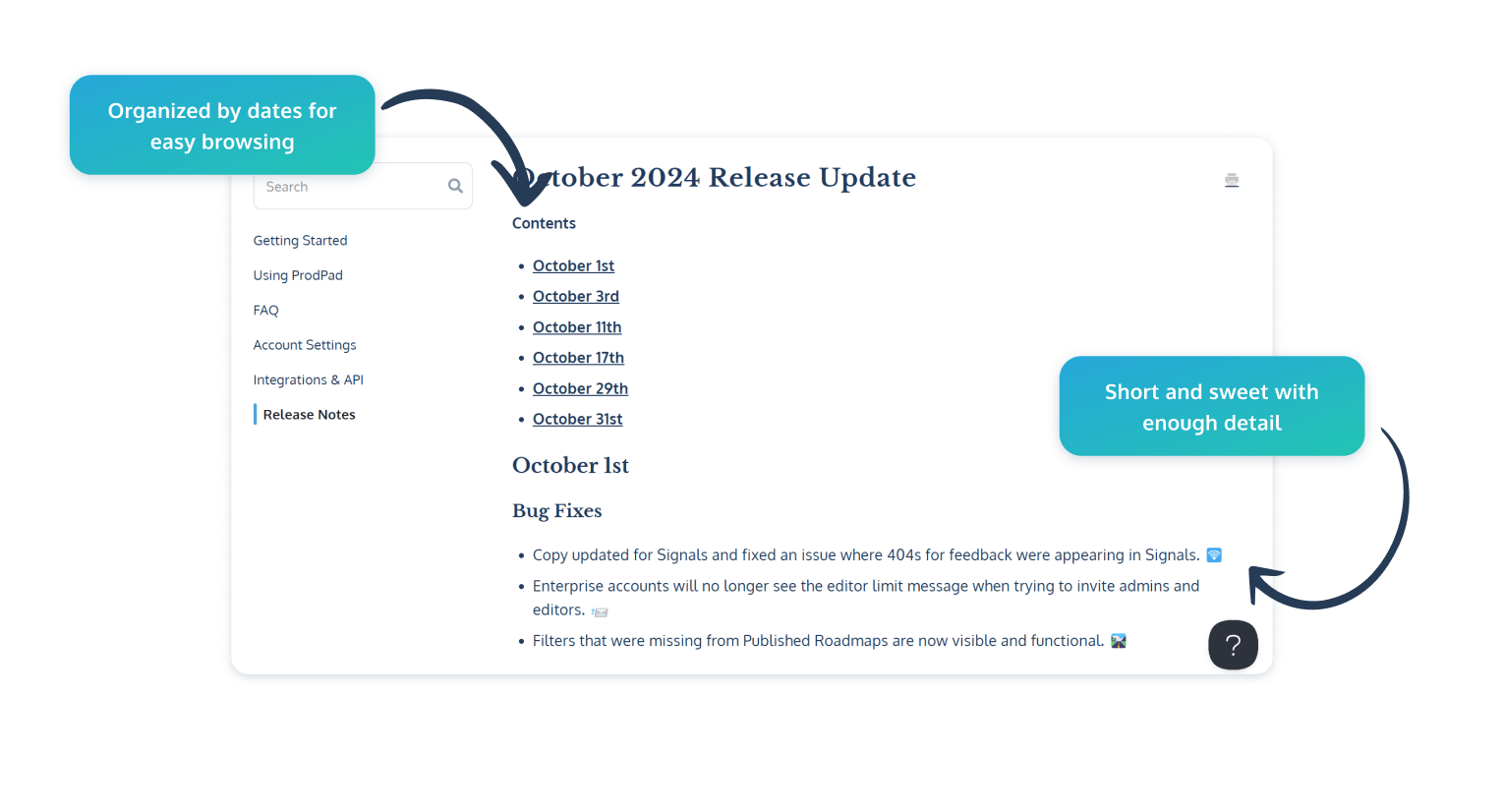
A core feature of our release notes at ProdPad is that we keep them very well organized. We like to keep things tidy, so organize by month, and then add links to all the different product releases that have happened during that timeframe.
This makes it easier for users to see the most recent changes. Plus, if a user tries our product, churns, and then returns after a few months, they can quickly check out previous release notes to see what’s changed during their time away.
We also separate each specific release note writeup into different categories, depending on what we’ve done. In our release notes, users can easily scan between bug fixes, UX/UI improvements, beta updates, feature updates, and loads more.
Our release notes are purposely short and sweet but go into enough detail to help users understand what has changed and why we’ve made the update. Big new features also have images and diagrams to help users understand these changes and quickly get started with our integrations and updates.
Unlike a few others, we keep our release notes within our Help Center. This gives users centralized access to self-serve and find release notes without needing to wait for an update email or notification.
Release notes examples for design tools: Figma
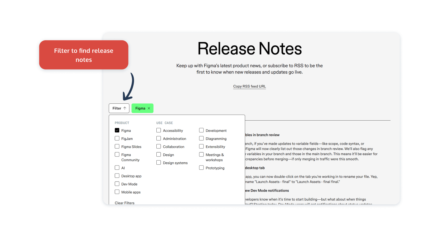
Figma is a design tool that has a lot of different user segments. Not every user is going to be interested in, or directly impacted by, a new release for a feature that they don’t use or need to use in their role. Figma understands this and makes sure that its release notes can be customized to each specific user persona.
This is done by organizing each release note into different categories and tagging them based on specific features and use cases. This allows users to filter through the updates and discover the information that’s most relevant to them.
This is a great approach to adopt yourself, as it prevents users from being bombarded, and works great if you have a varied user base all using your product in different ways. The best release notes are relevant release notes, and following this release notes example helps you customize your documentation to the right users.
Release notes examples for customer support tools: HelpScout
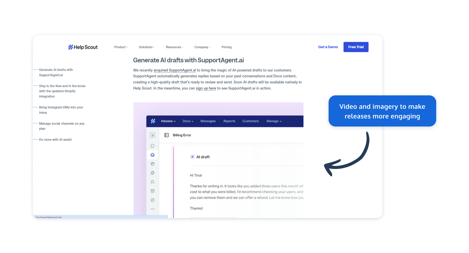
HelpScout understands the value of making release notes engaging. They do this by supplementing their release notes with imagery and product tour videos to provide a more demonstrative way to showcase and educate users on their changes.
This approach can improve overall feature adoption, and reduce the number of confused messages to the Support Team, making sure that users understand and explore the full range of the product. By doing this, the help center and live chat software product keep release notes personal and turn them into a supercharged marketing opportunity.
They include loads of shoutouts for readers to try their new products, detailing the benefits of the new updates and how they help multiple types of users, giving them incentives to explore more.
Release notes examples for analytics tools: Mixpanel
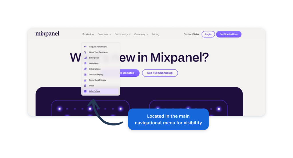
The way Mixpanel handles software release notes is a great example for Product Managers who want to boost the visibility of their release note updates. Their approach here is to have their release notes front and center and easily navigational as part of their main website menu. This makes it super easy for users to access their changelog.
We think this is a great idea, as there’s no point hiding your release notes away in the back corners of your website or app. You should be proud of your release notes, so show them off.
Another great approach from Mixpanel that you’ll find in many release notes examples is that they organize their release notes in a blog style. Most SaaS product users have experience reading blogs, so this approach makes release notes familiar to users and easier to understand.
When viewing the blogs in Mixpanel, you first only see the main highlights, making it easier to scan through the product releases, while also giving you the option to dive deeper and learn more on any that interest you through a clear call-to-action.
Release notes examples for communication tools: Slack
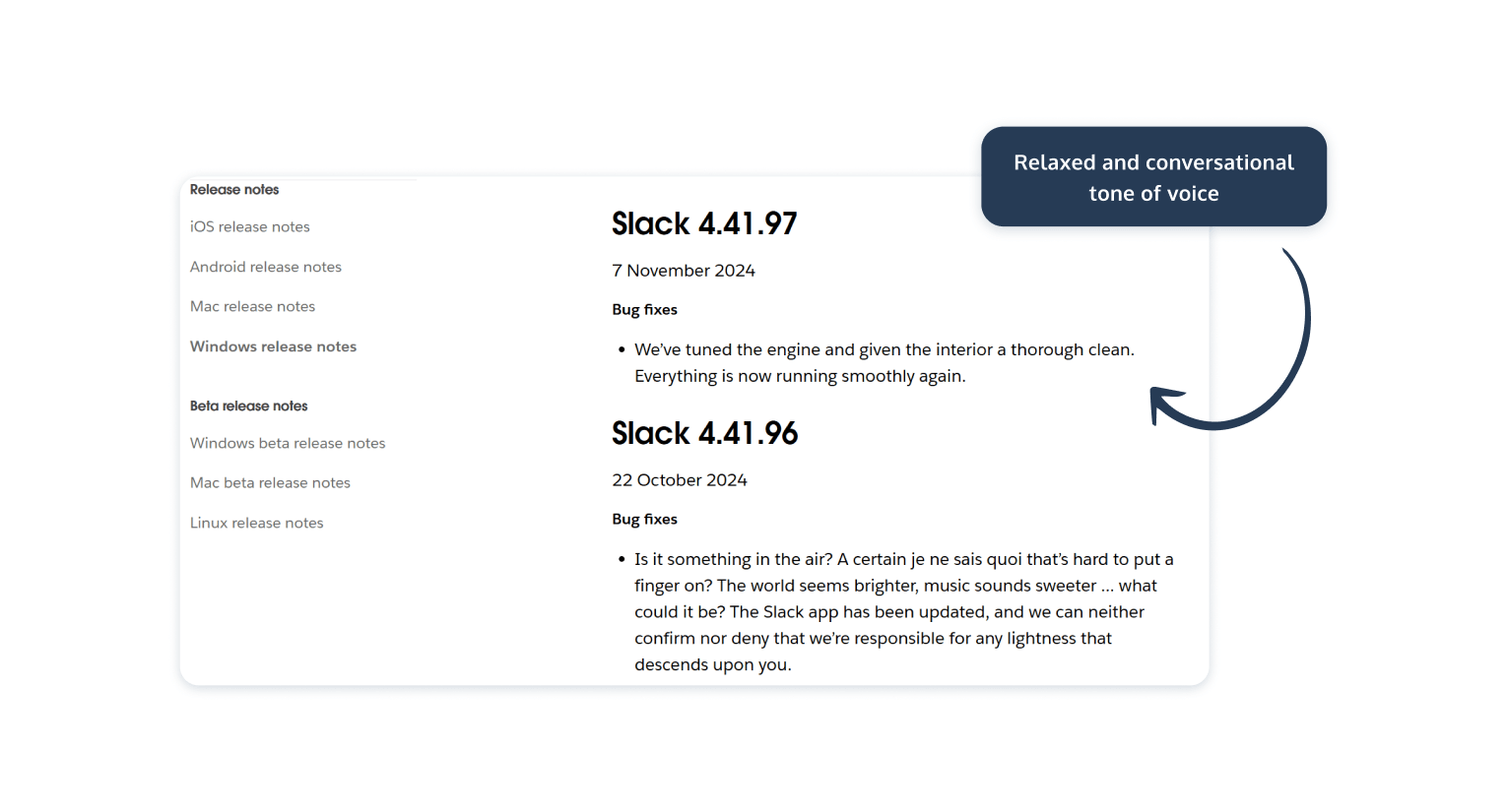
The release notes from Slack are a particularly striking release notes example due to the uber casual and friendly way their notes are written. They read more like a conversation than a serious document, which goes well for a business in the communication industry.
Now we wouldn’t recommend emulating everything about Slack. Often their release notes are pretty short and lack explanations, but we are big fans of their approach to the tone of voice, serving as a reminder that your release notes need to match your brand voice and should have some character and personality within them. If your release notes are dry and boring to read, they’re not going to be as effective as they could be.
What’s nice is that Slack consistently posts updates, even if there have been seemingly minimal changes. Sometimes it can be frustrating to check out a release note and just see ‘bug fixes’. Slack takes this as an opportunity to inject character, with some of their release notes turning into comical musings. When things get serious, or a bit complicated, they also link out to explainers to cover the more technical details.
Release notes examples for CRM tools: Salesforce
Maybe you’re less keen on little-and-often release notes. Maybe, it suits you better to collate all your updates into larger, less frequent release notes. This is the approach Salesforce makes to suit its audience instead of a consistent stream of smaller less impactful updates.
Salesforce publishes three release notes a year in their spring, summer, and winter updates. This could be a good approach, as it ensures that your updates appear significant and helps to reduce the number of times your users will have to engage with your release notes. But, it can lead to them being pretty overwhelming and intimidating.
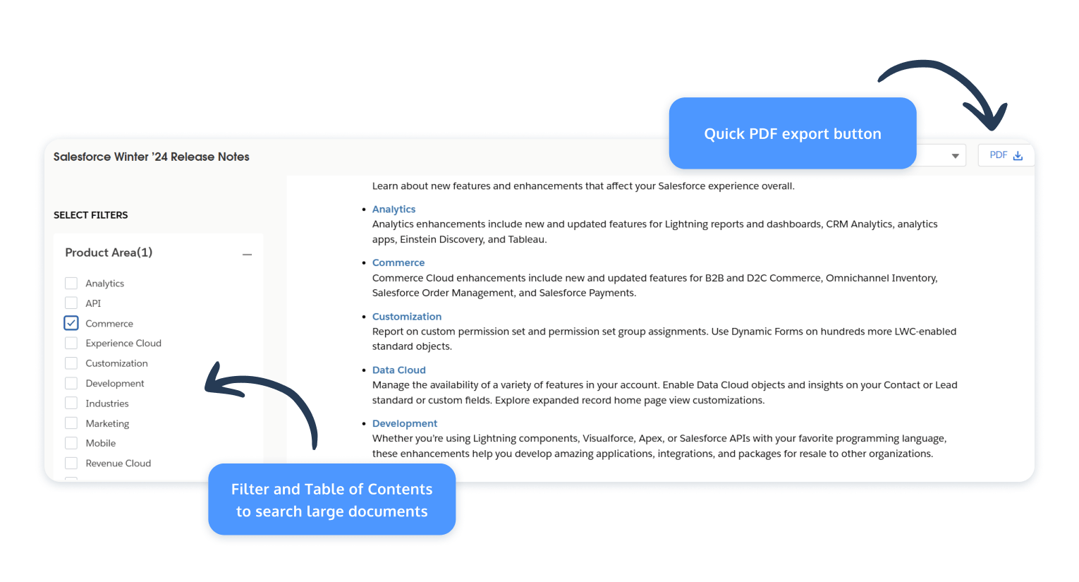
Although we’d suggest keeping your release notes snappy and easy to digest, sometimes you’ve made so many changes and updates that it’s hard to do so. In that case, we’d definitely recommend implementing the filter approach that Salesforce has done with theirs.
This is somewhat similar to the Figma approach, with the main difference being that you can also jump between headings tags that interest you from a Table of Contents. This can make these larger documents easier to get through. If you’re only interested in a specific area of Salesforce, you can also filter by product area, feature impact, and by products.
This helps users find information that best suits what they need. You can also export your filtered view as a PDF to have as your reference whenever you need it.
Release notes examples for marketing tools: Hubspot
HubSpot’s software release notes stand out due to their clear and user-friendly structure. They achieve this by having a lot of the previously mentioned functionality, like adding a filter, using a blog-style approach, and having it as part of their help center.
What stands out instantly is the visual approach to Hubspot’s release notes, especially when first searching for them. With a distinct color scheme, you can easily identify release notes alongside other useful updates that may be interesting.
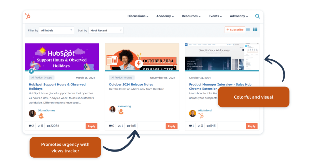
A nice touch is a total views tracker. This can help readers understand what’s worth reading by seeing if it’s been heavily interacted with or not. A release note with many views is likely more important than one with fewer.
Hubspot’s approach emphasizes accessibility and consistency, with well-organized notes that are easy to find within their help center. Consistent formatting across all updates builds trust and improves user experience, as they know exactly where to look for each type of information. This familiarity can also build brand identity, so it’s important to follow suit and stick with a consistent, reoccurring style.
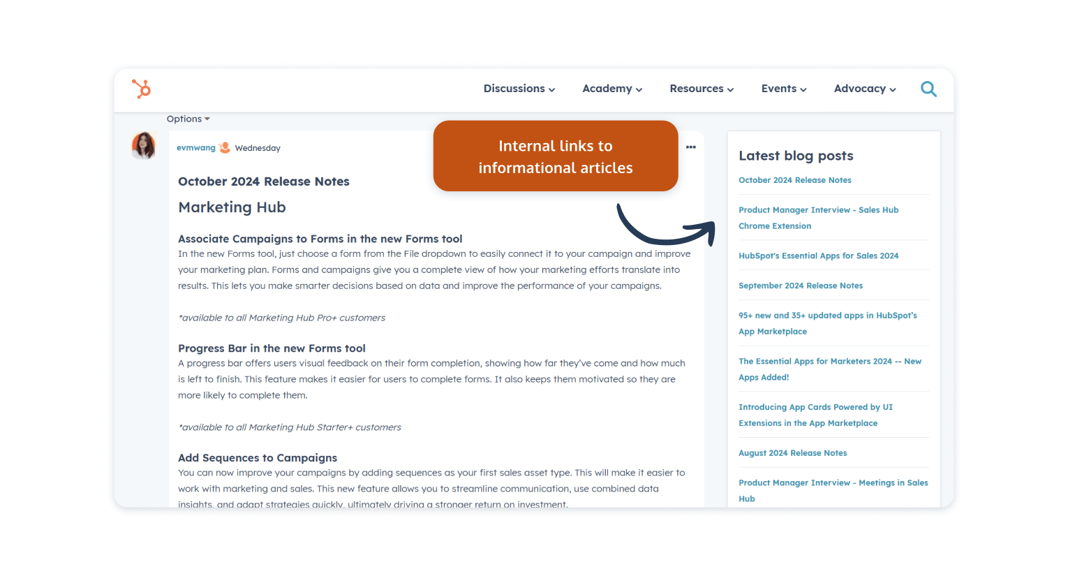
Our favorite thing about Hubspot is that they include links to their blog posts, making it easier for them to find useful educational material and continue their learning.
Release notes examples for Project Management tools: Trello
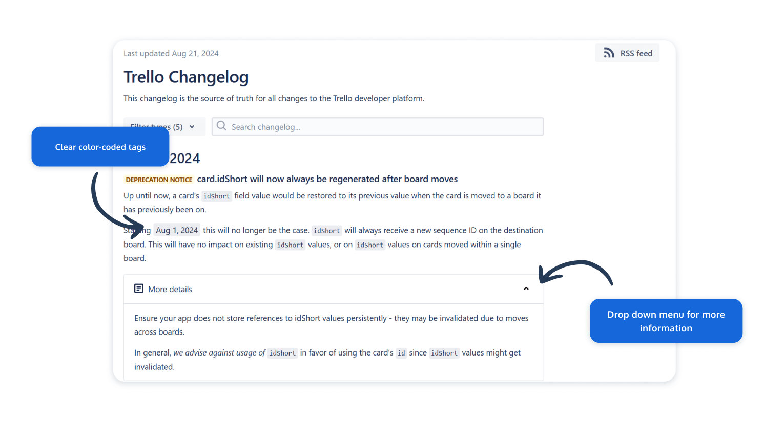
Trello approaches their release notes in a very straightforward manner. In fact, they’re more like a changelog, documentation traditionally meant for your development team that removes some of the extra fluff and detail that makes release notes what they are. They keep things simple with short, bullet-pointed updates that highlight the new features or fixes.
Each release note entry is succinct with plain language, allowing users to quickly scan through and get a sense of what’s been added or modified without overwhelming them with too much information. This format is ideal for Trello’s user base, which includes both technical and non-technical users who want fast and easy access to relevant information.
Doing something similar can be a good option if you value easy-to-absorb release notes, but we like things with a bit more meat on the bone that goes into a bit more detail to provide context.
What we do like about Trello is that they include clear tags to make it very easy to see what each product update is about on their changelog. These tags are color-coded and easy to search for, helping users find updates that they care about most.
If you want more information about each update, there are dropdown menus that add extra context and relevant links.
Release notes examples for E-commerce tools: Shopify
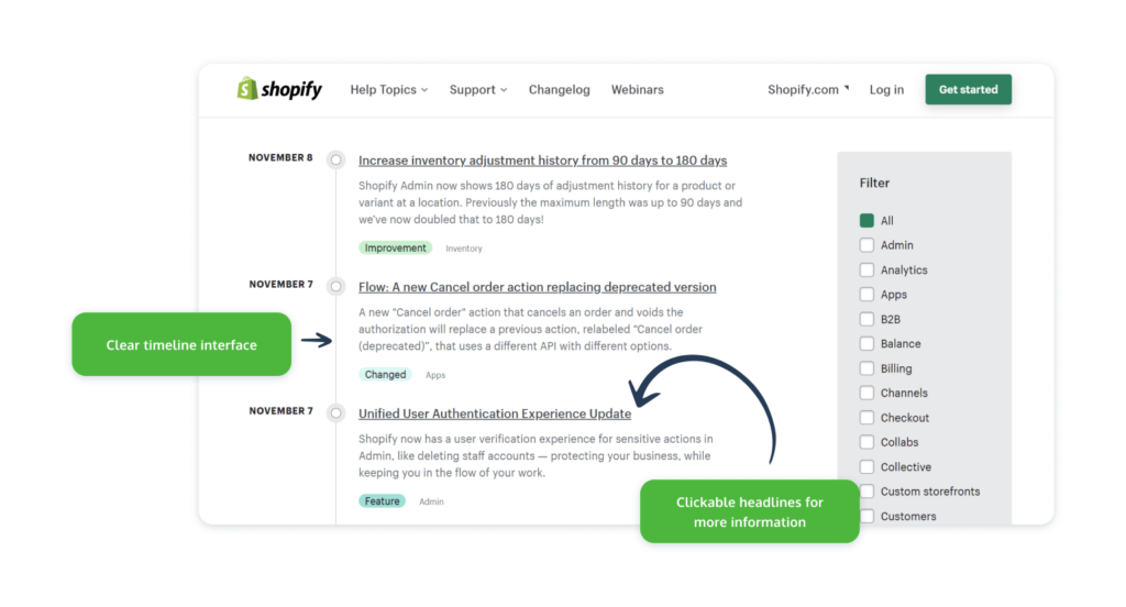
Shopify also swaps traditional release notes for a more technically-minded changelog. As their customers are e-commerce platform creators and users, this approach makes sense for the majority of their audience. Still, they keep things clear, using a very novel timeline approach to help separate product releases and make it clear what’s happened and when.
As with others on this list, you can filter through based on product type and features you use, and can also easily see if each update is an improvement, a change, or a new feature.
If you come across a release note that you like the look of and find interesting, you can click on the headline to learn more and get more information about the change.
Release notes examples for fintech tools: Stripe
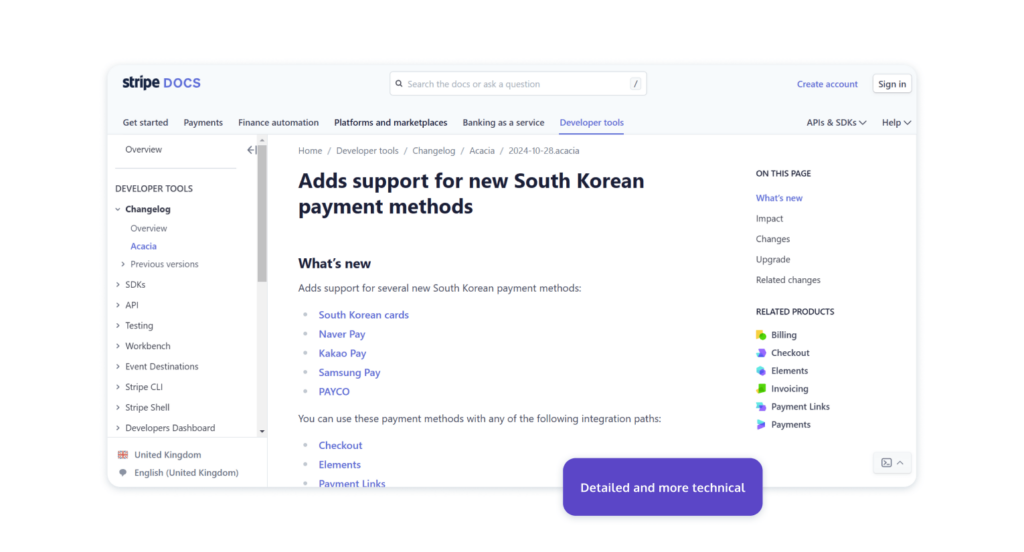
Stripe is a bit of a two-in-one, as instead of having one release notes example, they have a couple. Stripe has two different changelogs depending on the target audience, with one being designed to provide technical details, while the other created to be more universal and easy to understand for all.
This more jargon-free and accessible changelog is found on their blog and organizes their entries across a timeline.
These release notes don’t go into deep detail, instead just contain a headline about the change, alongside a category tag so that users know what features this change impacts. Like many other release notes, you can filter based on the tool, helping you find the release notes you need.
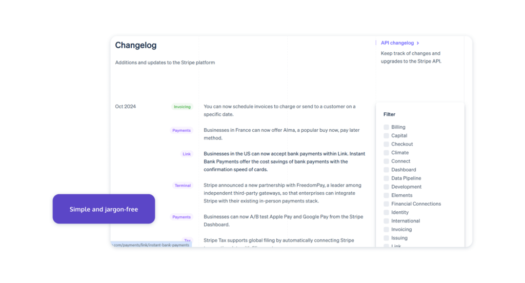
From this more universal release note example, you can click on each item to be taken to the more technical and detailed changelog, found on their Stripe Docs help center.
When viewing this version of the changelog, you get a hell of a lot more information, a lot of which may be too technical for all users. Like the non-technical version, you can still scan the headlines, but then access documents that provide more information on what the change is, how it impacts the user, and how to upgrade to make use of these changes.
If you have a couple of different types of users that are distinct from each other, it could be wise to follow this approach and have two different release notes or changelogs, directing the appropriate audience type to the release notes that suit them.
Learn from what’s around you
To wrap up, remember: leveling up your release notes isn’t just a box to check; it’s a real opportunity to connect with users and build excitement around your product. By exploring how others are shaping their updates, you can pull in fresh techniques and discover what might resonate best with your own audience.
The examples here showcase just how creative you can get with structure, tone, and delivery – these brands make their release notes work harder, standing out as more than just routine updates.
Take some inspiration from these examples and don’t be afraid to experiment. Whether it’s adding visuals, adopting a friendlier tone, or even crafting stories around your updates, each of these approaches can give your release notes that extra polish.
Aim to turn a simple product update into a moment of connection with your users, keeping them engaged and invested in your product’s journey.
If our approach to release notes has sparked your curiosity, why not see it in action? Dive into ProdPad’s open sandbox, where you can explore all our features in a preloaded environment designed to give you hands-on experience. It’s a unique way to see how great release notes and powerful tools can make you a sharper, more effective Product Manager.
Explore the ProdPad sandbox.