User Onboarding: The UX Behind Our Magically Extending Free Trial
This is the first of a two-part series that looks into the rules we broke and the risks we took to build out our new user onboarding flow at ProdPad.
We’ve been experimenting with our new user onboarding since we launched ProdPad, but our latest iteration is getting us quite a bit of attention.
- It’s unexpected. We’ve shortened our trial period from the standard 30 days to just 7 – and no one’s complaining.
- It’s fun. We’ve gamified the trial, rewarding our new users with more free time in ProdPad the more they use it.
- Most importantly, it’s working. It’s helping us meaningfully engage with our newest users, and speeding up our trial-to-conversion rate.
Here’s how following our nose (and our customer data) helped us design a user onboarding process that has been winning us paying customers faster than ever.
What’s the point of a 30-day trial anyway?
When we first launched ProdPad in early 2013, we had no good reason to offer our new users a free 30-day trial. We did it because everyone else was doing it.
But in addition to our conversion rates, we kept a close eye on our time-to-conversion rate. We wanted to track not only how many trial users were converting, but how long it was taking them to make the decision.
This turned out to be a worthwhile effort, because what here’s what we found:
We found that on a 30-day trial, we could tell with 85% certainty by Day 9 whether a trial user would sign up.
In other words, it was taking our users on average only about a week to decide whether they wanted to pay for ProdPad.
So why were we giving them another three weeks? As an experiment, we decided to halve our trial period to 14 days and keep everything else the same.
That one move doubled our conversion rate.
Without that luxurious month-long trial to waste, users immediately started to value their trial time more. They were getting right to work, completing key tasks within the first few days and signing up for paid accounts within days, not weeks.
From this zero effort move, we learned that many of our trial users were actually ready to make a decision quickly – and longer trial times were a distraction.
We had our chance to make another radical change to our user onboarding when we launched our new version of ProdPad late last year.
The overhaul was geared toward our existing users, who were starting to ask for more advanced functionality to support their product management workflows.
But we had left our new users behind. We were sending them to a new dashboard that stared blankly back at them. No help and no guidance around what to do first. And accordingly, our conversion rate flatlined.
We had the opportunity to start from scratch.
So we threw out the idea of a fixed trial time – after all, we already knew that not all our customers needed a 30-day or 14-day trial to know they wanted to buy ProdPad.
At the same time, our most frequently incoming support tickets were requests for more time – mostly from engaged users who needed more time to test.
We looked to Dropbox’s free extra space you can earn and Slack’s free credits. Both solid systems that offered attractive incentives for new users.
We didn’t have either of those mechanisms, but what did our users value that we could give away?
Time.
So what if we offered 7-day trial…but the more you use ProdPad, the longer your trial becomes?

What if we gave every new ProdPad user exactly the amount of time they need to decide they want to be ProdPad customers?
It was just an experiment, but we started digging in.
How we designed our magically extending free trial
First, we brainstormed: 30-second mockups
Remember, at this point we had no user onboarding. Nothing.
And if we were going to put our money on a 7-day trial, we needed to make sure our users could see immediate value during their first session.
So we started with 30-second mockups.
If and when you have nothing (or you’re building a concept from scratch), I highly recommend trying 30-second mockups.
Making impulsive design decisions gives you a tangible place to start when you have a big question like, “What would be the perfect onboarding flow?”
This is how it works: Take a piece of paper and fold it in 4 so you have 4 equal boxes. Then timebox (3-5 mins) and get everyone to try to do 4 sketches each.
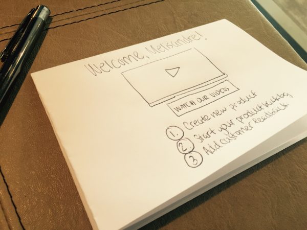
The time constraint forces people to get a concept on paper without giving them time to overthink it. The result is a lot of creativity and interesting ideas that otherwise might not come out.
We got together in a room – myself, our Head of Customer Success, and Head of Growth – for one of these sessions.
We already knew through tracking past user behavior which three steps we could be reasonably sure would lead to conversions:
- Enter their first product
- Start their product backlog by adding an idea
- Start their feedback log by adding customer feedback
So we needed to think about how we could communicate these key actions to all our users.
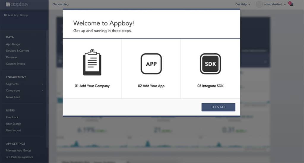
With an account-focused onboarding wizard, like Appboy?
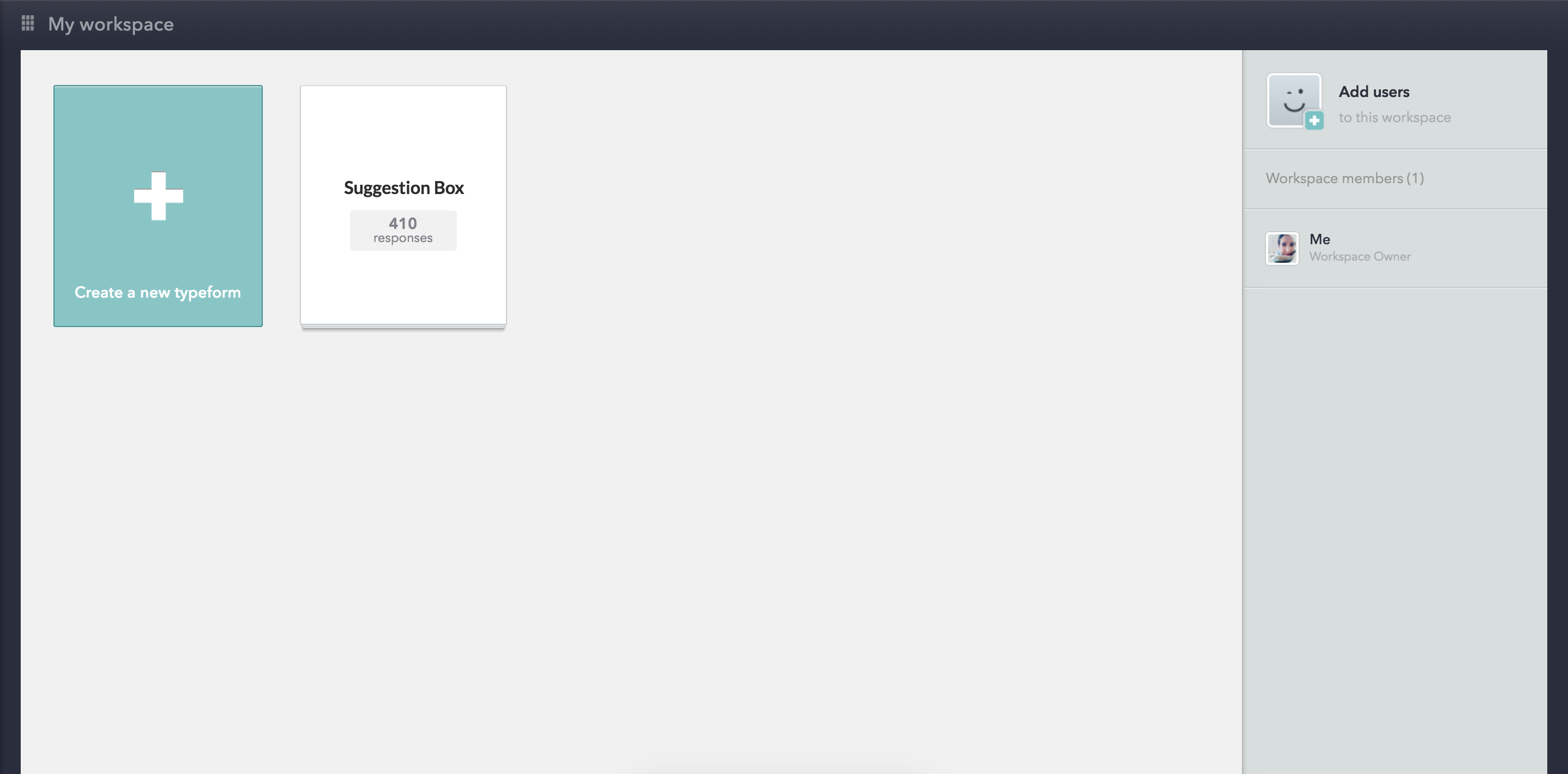
With a doing-focused onboarding flow, like Typeform?
Unsurprisingly, our first round mockups all looked very different. We expected that. This exercise was designed to bring out our interpretations so we could reconcile them with our experience and intuition.
After our first round, we took turns explaining the design decisions behind our rough onboarding flows.
We took what we liked and went through a second round of 30-second mockups.
Each round, we played devil’s advocate.
How would they use this? What happens if they do this instead? What would this look like if X were left blank? Did you think about X as an option?
And at the end of our 30-second mockup sessions, we had combined our ideas into a single flow.
Now, how could we turn this into a high-converting dashboard for our new users?
We designed an introductory dashboard for badass users
Here’s what we knew we were dealing with:
- Our customers are product managers. (They’re self-directed and many already have a strong sense of what they want/need.)
- They don’t want to be forced down a certain path. (One path would be restrictive when our customers come to ProdPad to solve varying pain points.)
- They sometimes have deal-breakers. (For example, they’re looking to test a specific integration and want to move on fast if they don’t find what they’re looking for.)
And here’s what we wanted to do for them: make them feel badass.
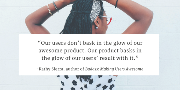
The idea of badass users comes from Kathy Sierra, who suggests in her book, Badass: Making Users Awesome: “Make people better at something they want to be better at.”
Product managers come to ProdPad from different paths – some as seasoned pros and others as newbies.
We wanted to make both feel like they were becoming better, smarter and more confident product managers from the moment they land on our dashboard.
And so, taking a page out of Sierra’s book, we made this the first thing our new users would see once they created their account:
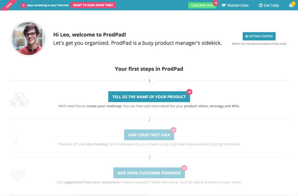
Here’s what new users would now see:
1. “Your first steps in ProdPad” list
The three steps we identified before surfaced here on the dashboard as a suggestion of how to get started on ProdPad.
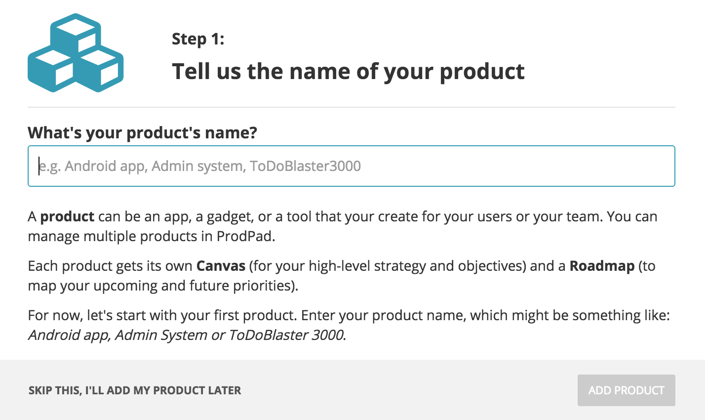
It’s not a forced onboarding flow. Once you land on the dashboard, you’re free to explore the product as you wish.
This is a concession to those product managers who come storming in looking for the features and functionality they already know they need.
For all other users, these three steps offer direction and a bit of handholding.
Our first steps were benefit-driven and heavy on context. In Step 1 (“Tell us the name of your product”), we explained that we need a product name to create a product canvas and a product roadmap.
Then we send them straight to their new product canvas, where our Appcues hotspots take over to point out what to fill out next (and in the example below, even link them to useful references).
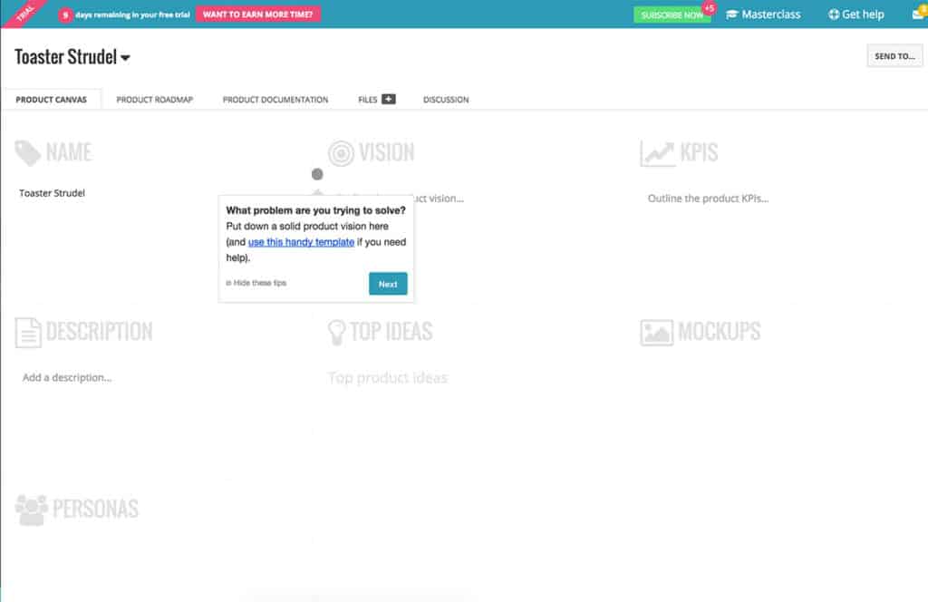
This helpful-but-not-Clippy onboarding strategy helped us build an early sense of trust with our new users.
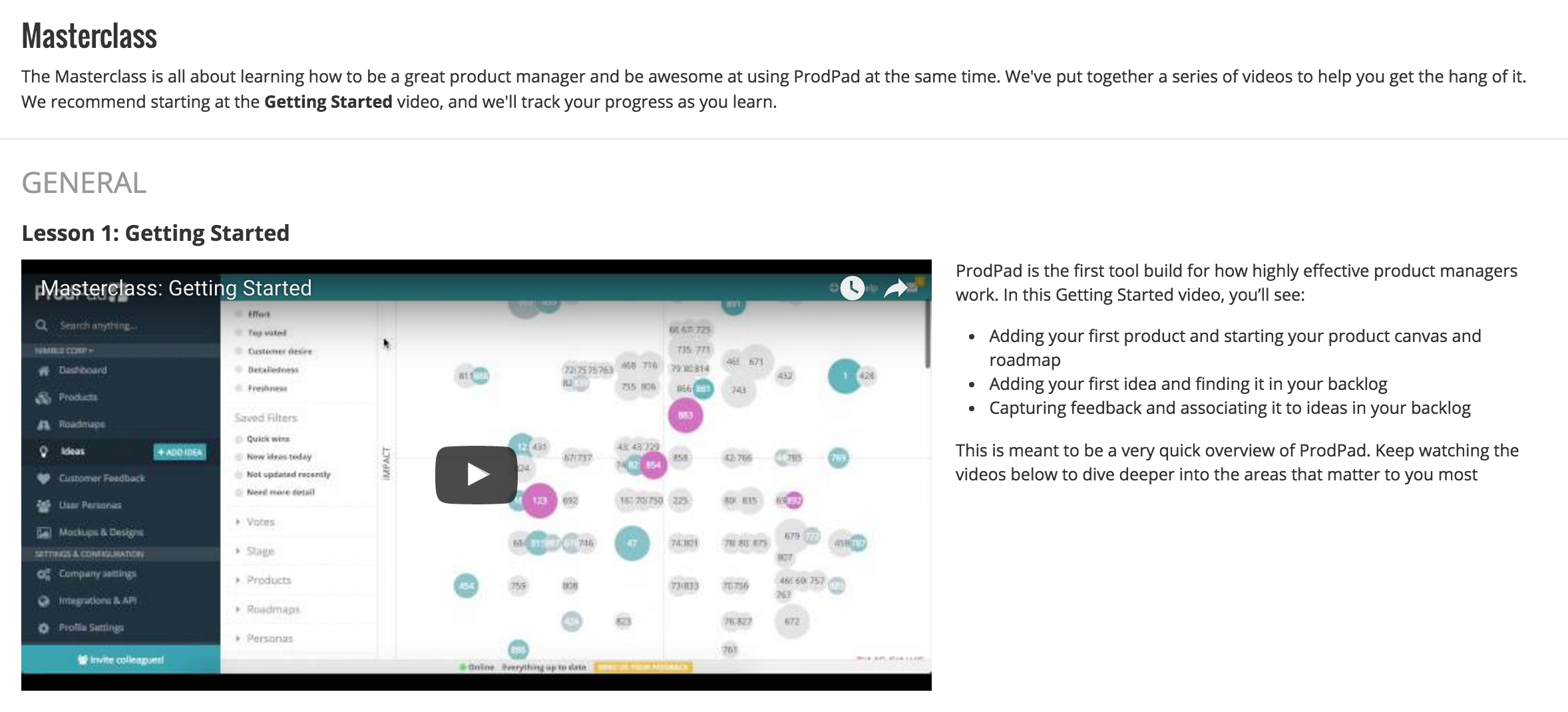
2. Masterclass videos
We included a link at the top right hand corner of our dashboard to a short series of videos. Some people learn by doing, and others learn by watching. With these short two-minute clips, we had now covered both.
This too, was a concession to the possibility that not all our users invest in learning new products the same way.
3. An easy, limited dashboard view
Once you’re in the swing of things, the ProdPad dashboard becomes more active. For example, we open up this product backlog overview:

And then we introduce you to your activity feed:
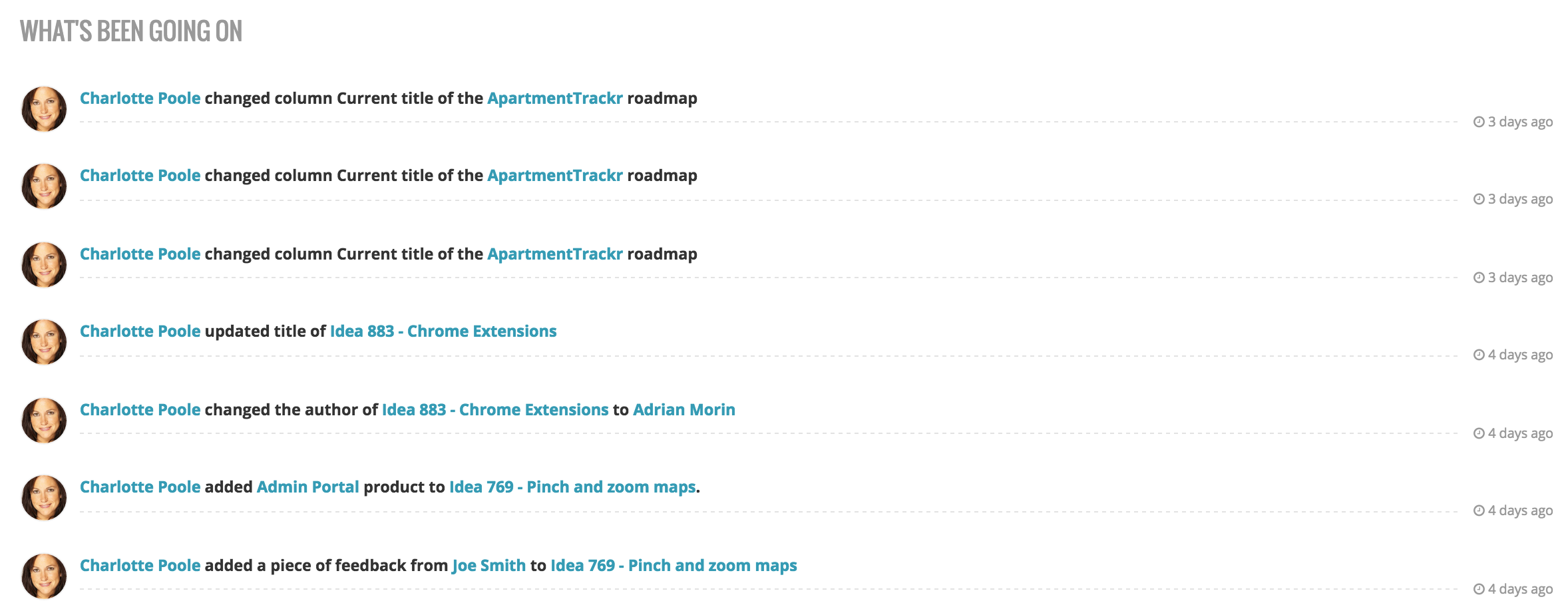
But when you’re just starting out and you don’t have an idea backlog or colleagues with you on ProdPad yet, you don’t need an empty stats and activity feed starting back at you.
We keep the introductory dashboard simple until our users complete the initial three steps. Then we open up new layers of functionality.
It’s the classic concept of progressive disclosure at work.
Ready, set…let’s launch our new 7-day trial!
Now we had a new dashboard and guidance for our new onboarding flow, we were ready to halve our trial time yet again. This time, to 7 days.
Our magically extending 7-day trial start extending almost immediately.
Entered the name of your product? 2 free days.
Added your first idea? 1 free day.
Getting an integration up and working is a bit more intensive, so 5 extra days for that.
We’ve made a list too, so our users can find more ways to win themselves more time.
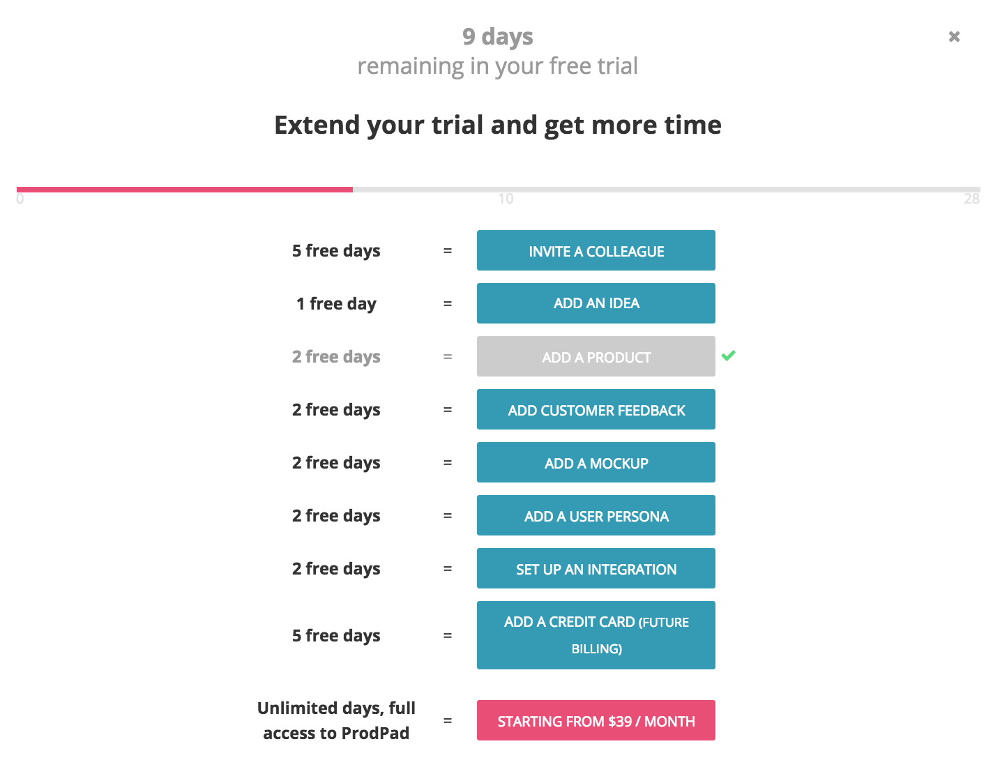
The unexpected gamification has had a sunny effect on our users.
They’ve been playing along, following the first three steps, and then seeking out more ways to get free trial time.
Some users are completing all the steps and unlocking the maximum trial time of 28 days. Along the way, they’re essentially teaching themselves how to use ProdPad.
In turn, the probability of a new trial user turning into a paid customer is increasing too. The odds are good.
What’s happened since then?
With our new user onboarding, we’ve seen our trial-to-conversion time once again double, and our overall conversion rate has tripled since our previous version.
It’s exciting to see the numbers roll in, but it’s not just about the numbers.
We’re getting great feedback too, which shows us that we’re on the right track.
This experiment has worked for us, but it won’t work for everybody. In fact, I’m not presenting this as a best practice at all.
Our magically extending 7-day trial is the result of data, intuition, and also the kind of unique relationship we want to build with our customers.
Our users are product managers just like us, so a lot of them have a deep appreciation for a well-done user experience. Our 7-day trial has caught a lot of them off guard, but it’s a good kind of surprise.
We know they want to see value fast – and we want to show it to them.
We know they want to feel confident at work – and we want to help them feel that way.
We know they want to feel supported – and we’re definitely here with resources and top notch customer support.
And this commitment only starts with our onboarding flow. If anything, it sets the tone for what’s to come.
In our next post, I’ll talk about how we designed persona-specific onboarding emails to boost our conversion rates along with our rad new onboarding flow. The two work together beautifully.
But for now, this is a reminder to follow your nose, folks.
We’ve designed our user onboarding – and our product management tool – to turn you into a highly effective product manager. Try ProdPad free today.
19 thoughts on "User Onboarding: The UX Behind Our Magically Extending Free Trial"
Comments are closed.

Janna,
Love this. Really love this. Thanks for sharing. Amazing the way you approached the gamification of the free trial period using this to highlight the trialists that are highly engaged. How did you decide the right extra days to grant for completing each step. Was it based on the effort they had to invest to complete the task or based on the tasks that best correlated to a trialist converting to a paying customer?
Good to hear from you Bob, thanks for the feedback!
The amount of time given for each action is based on a mix of both things you mentioned: The effort that the customer has to put into it (for example, it’s harder work to set up a new integration than it is to simply add an idea, so you get 5x the time for it), and partly how correlated the action is to getting them to subscribe (we know that once a person starts inviting their team, for example, they are much more likely to see the value in ProdPad and continue using it in the long term). We initially brainstormed a bunch of different actions and associated free time rewards, and tweaked these in a spreadsheet and got some feedback on it before locking in the numbers we’re using today.
I imagine we’ll probably adjust these as we go, based on which ones are triggered (or not) and based on what else we’d like to encourage the customers to do. At the end of the day, our goal is to get people accustomed to using the different areas of ProdPad and learning as they go, and this method is proving to be a great way to get them engaged!
Think you’ll try something similar in your own app?
Janna, wow this is soo fascinating! It makes complete sense how people would be motivated to learn how the product works by earning additional days for their free trial. I loved how you said “We want them to feel confident at work” – because it definitely helps if you know how to use the product well! Hope you don’t mind if I share with the SaaS Alliance community 🙂
By all means, thank you for sharing Alex! 🙂
Fantastic read, Janna. Thanks for putting this together. It’s great to see the positive results that can come from merging data driven decisions with gamifying strategies.
Did reducing the trial length affect the total number of people per day/week/month who signed up to use ProdPad?
Good question Ben! We did measure that metric, as we realised that there’s no point upping our trial-to-paid conversion rate at the expense of our visit-to-trial conversion rate. Fortunately, people still sign up for trials at the same rate, so we’re getting the full benefit of the improved onboarding conversion!
Our visitor-to-trial rate has also gone up lately as we made it easier to get started from our homepage (embedded sign up form, instead of a button and THEN the form). Nothing too groundbreaking there, but every little bit helps 😉
We’d need to do more detailed testing around this to say for sure, but I suspect that a lot of people don’t really care how long their free trial is, so long as they don’t have to enter a credit card to get started.
thanks for this, very helpful!
Hi Janna, interesting read, tnx!
Sounds like quite a bit of work to build this feature. Were you able to do some ghetto-testing before committing fully to re-building the trial?